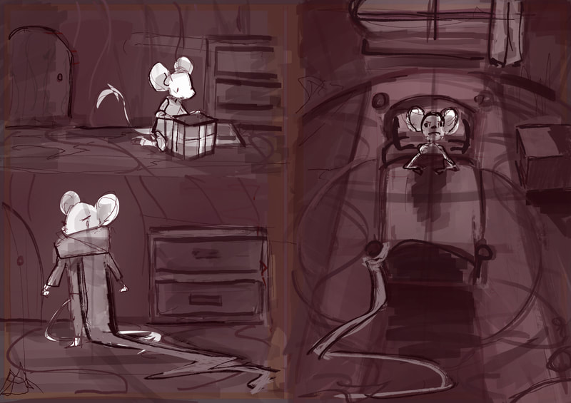
Redesigning
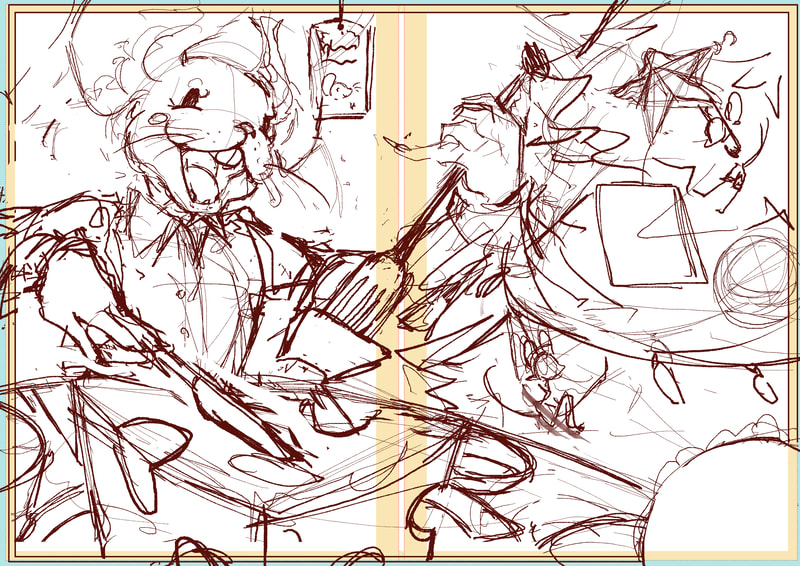
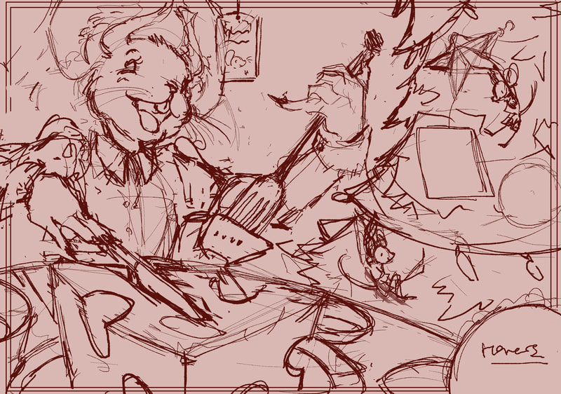
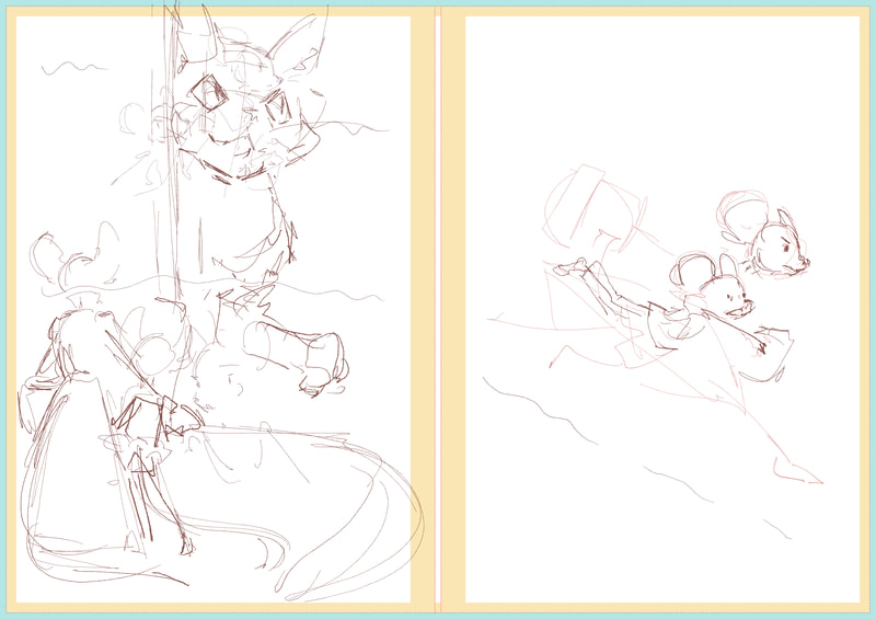
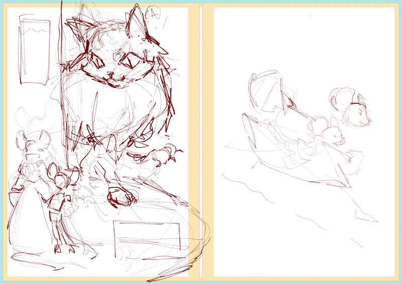
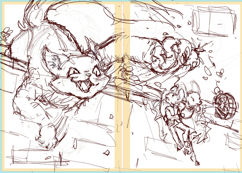
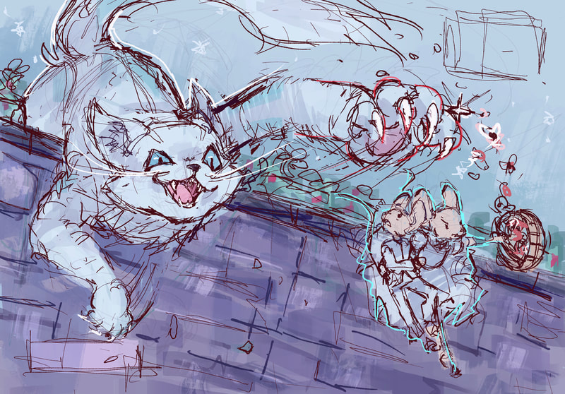
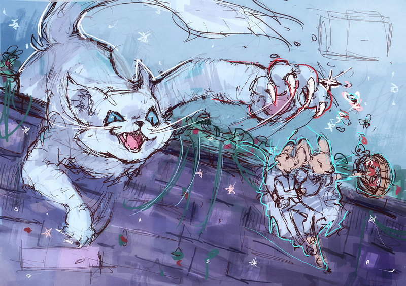
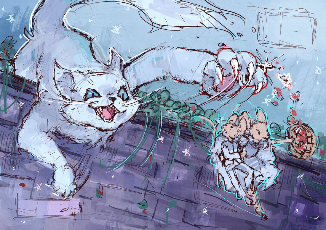
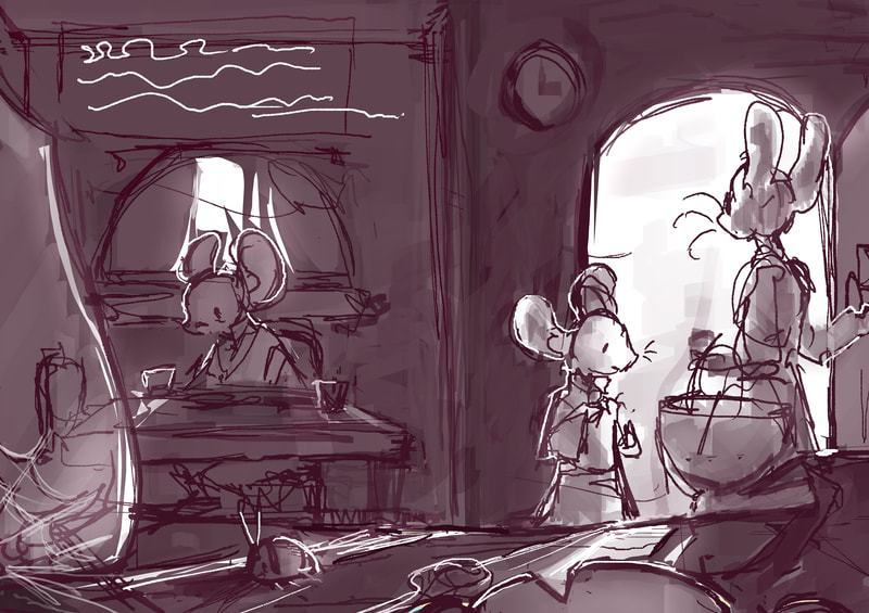
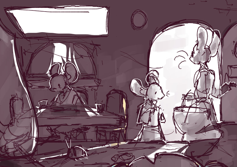
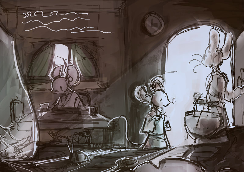
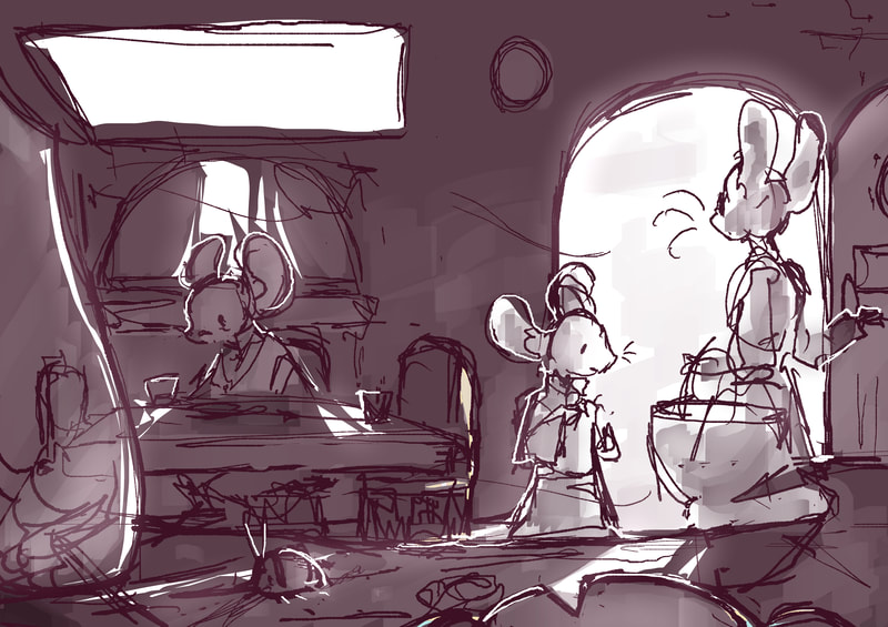
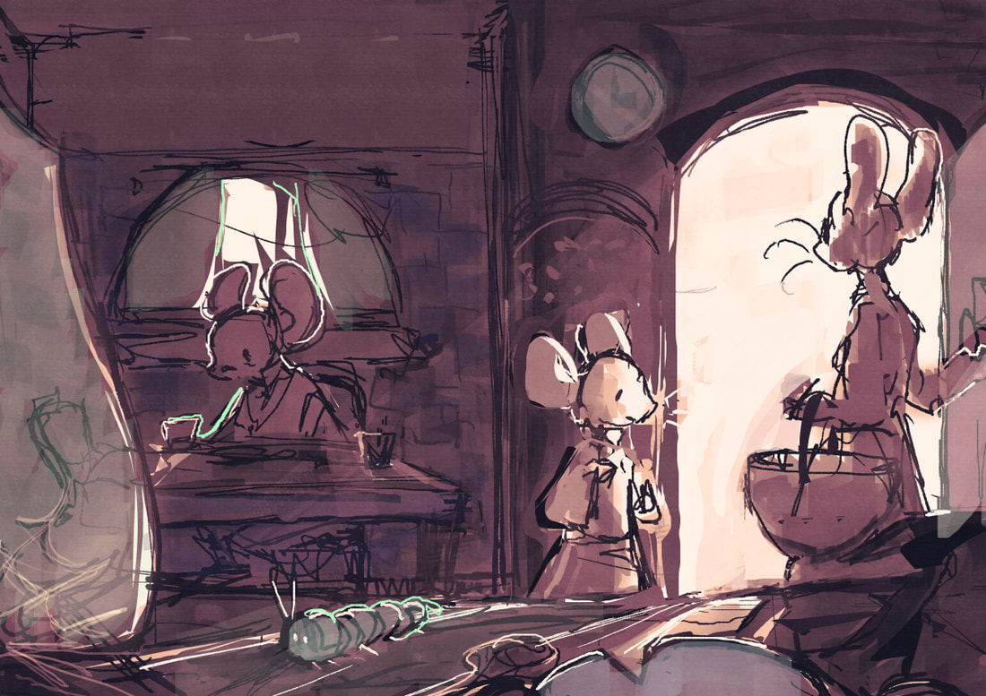
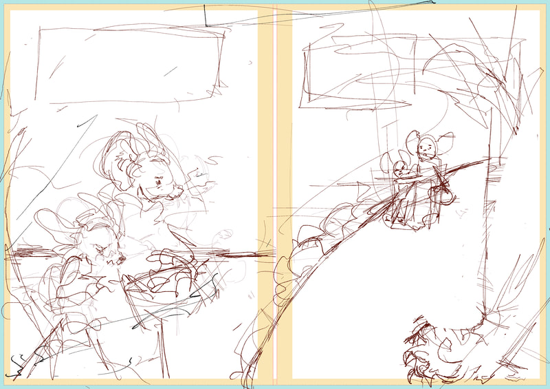
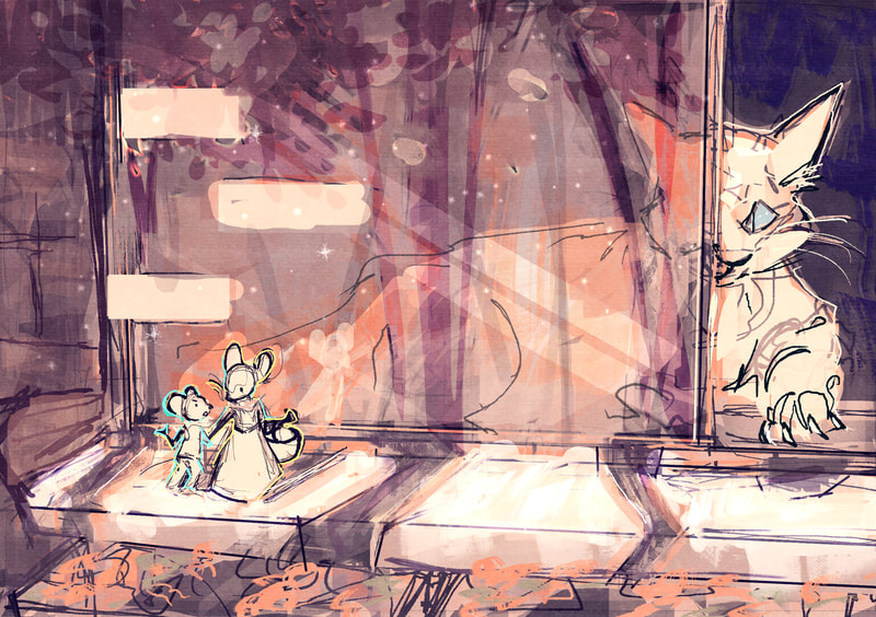
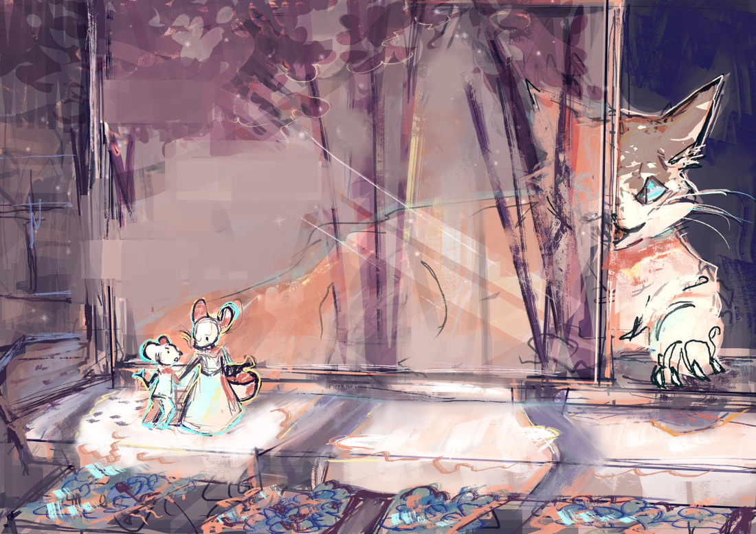
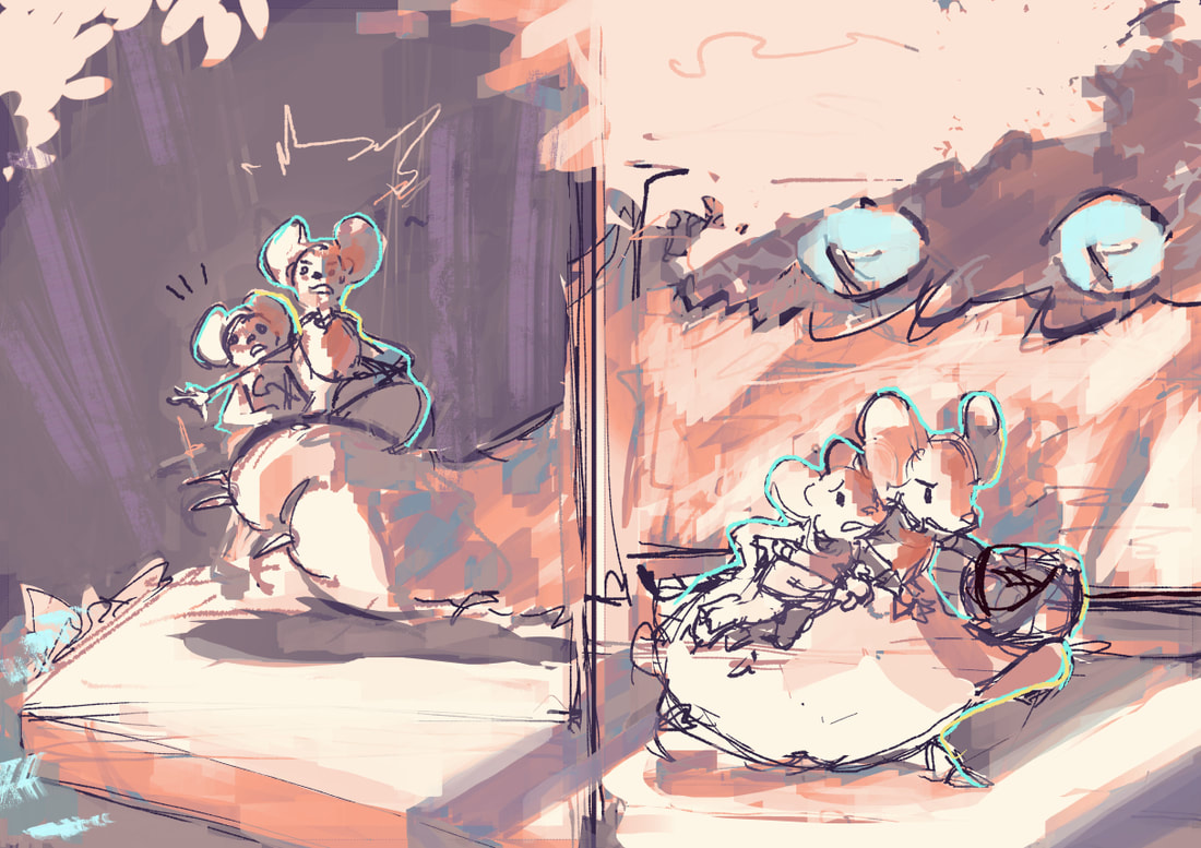
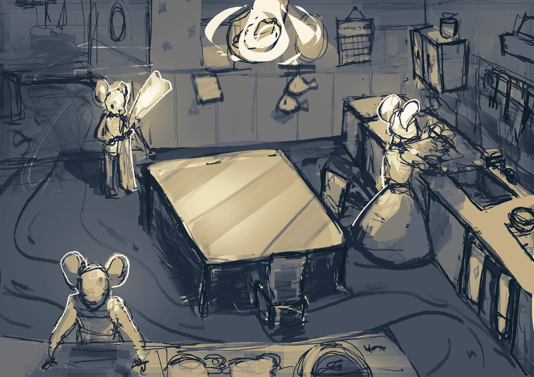
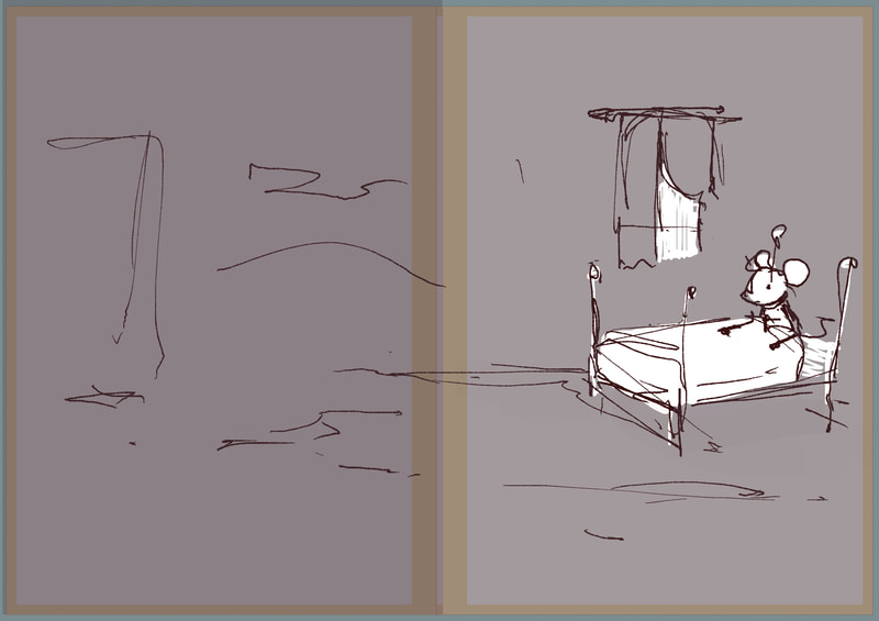
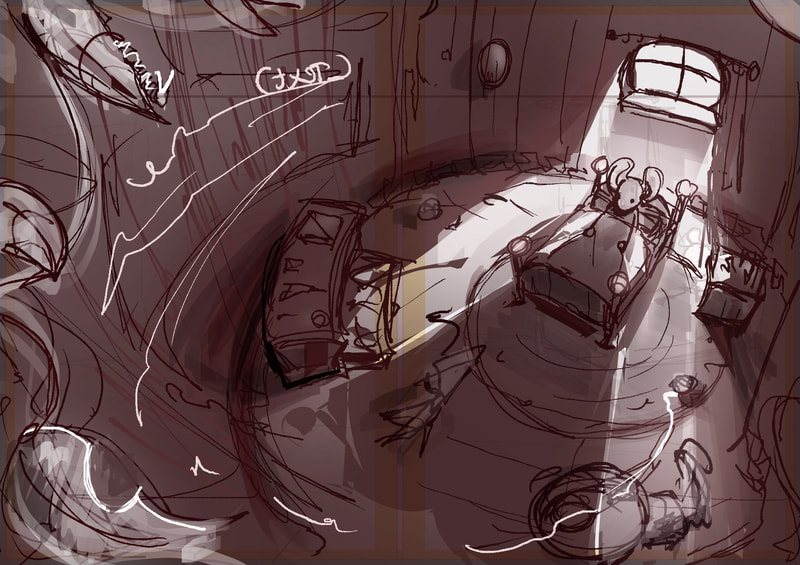
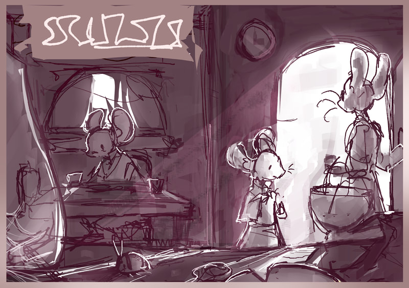
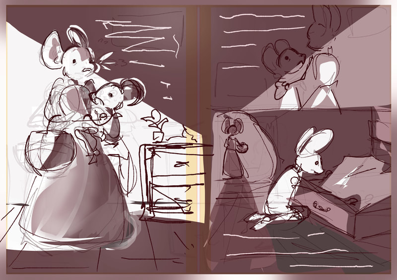
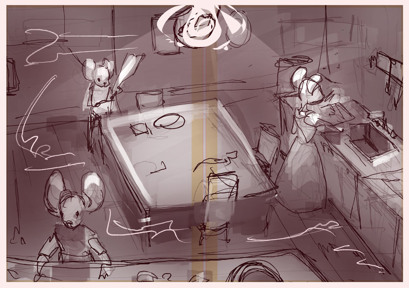
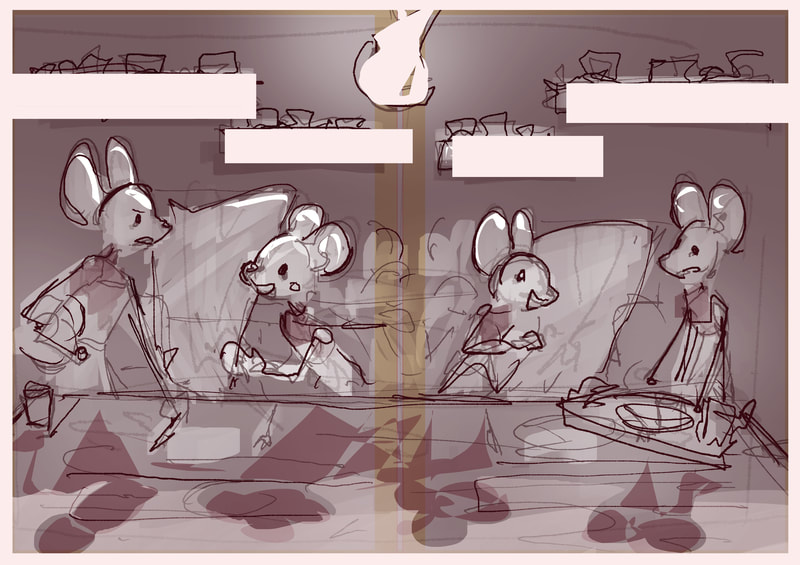
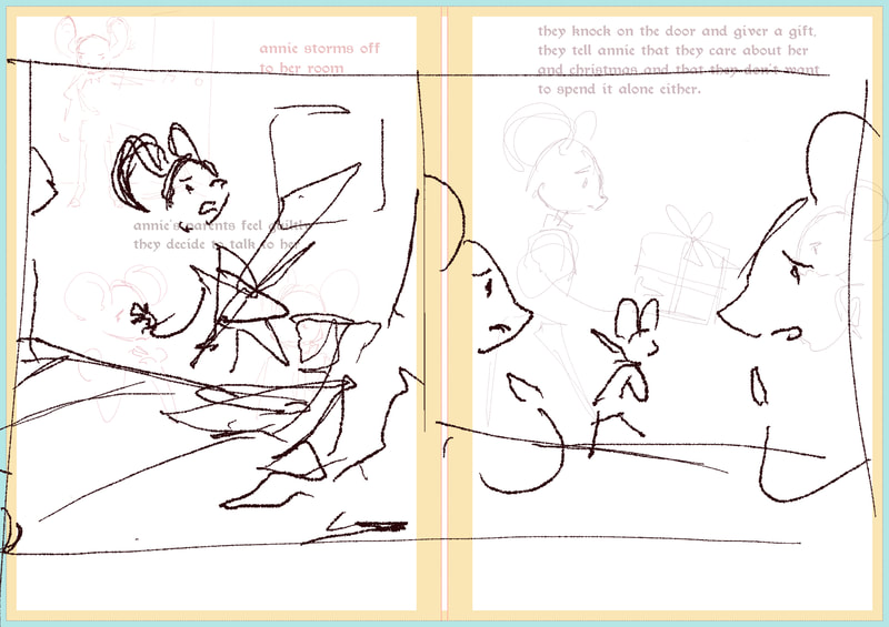
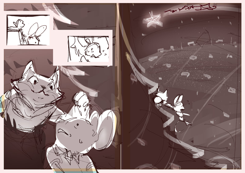
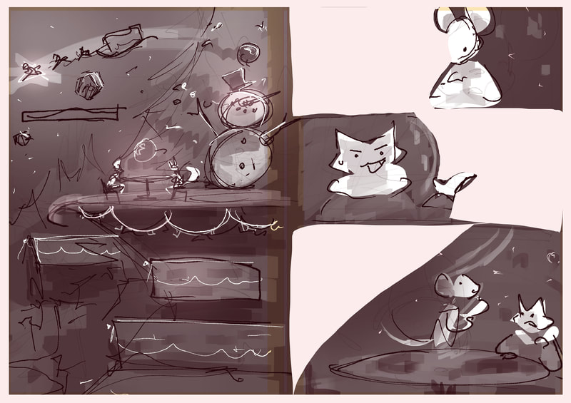
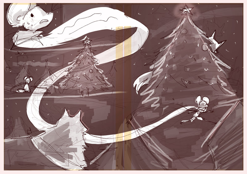
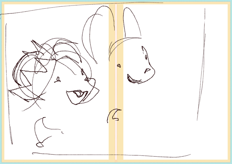
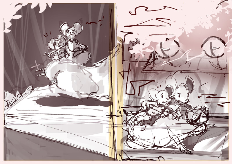
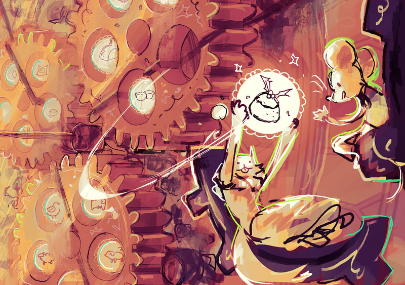
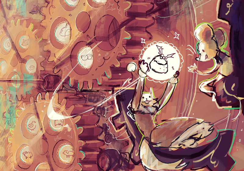
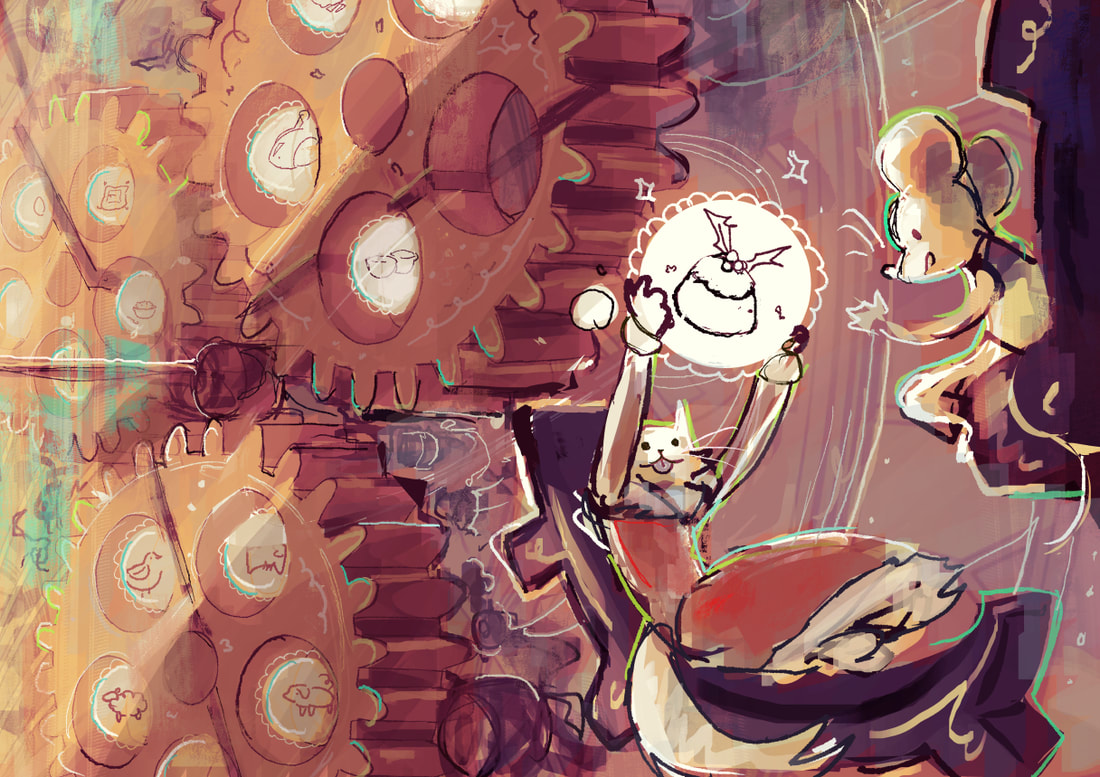
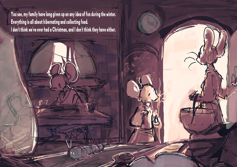
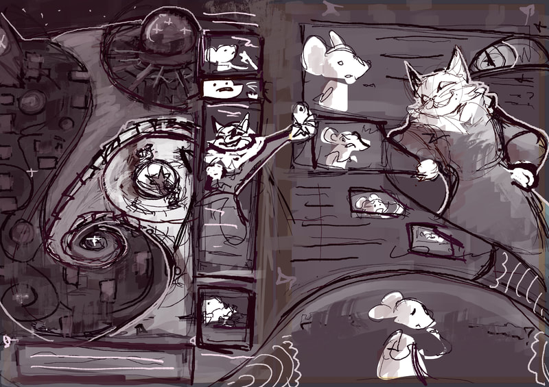
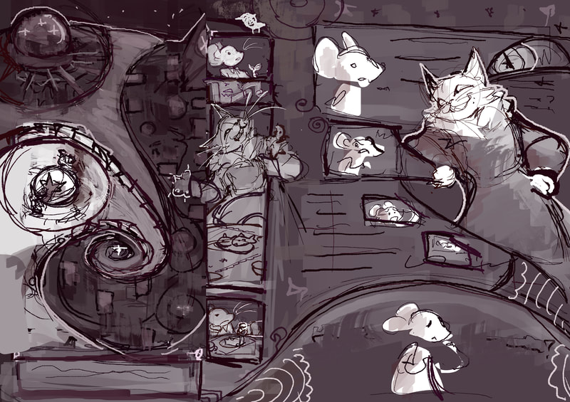
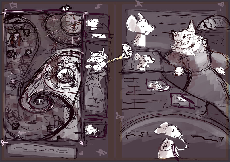
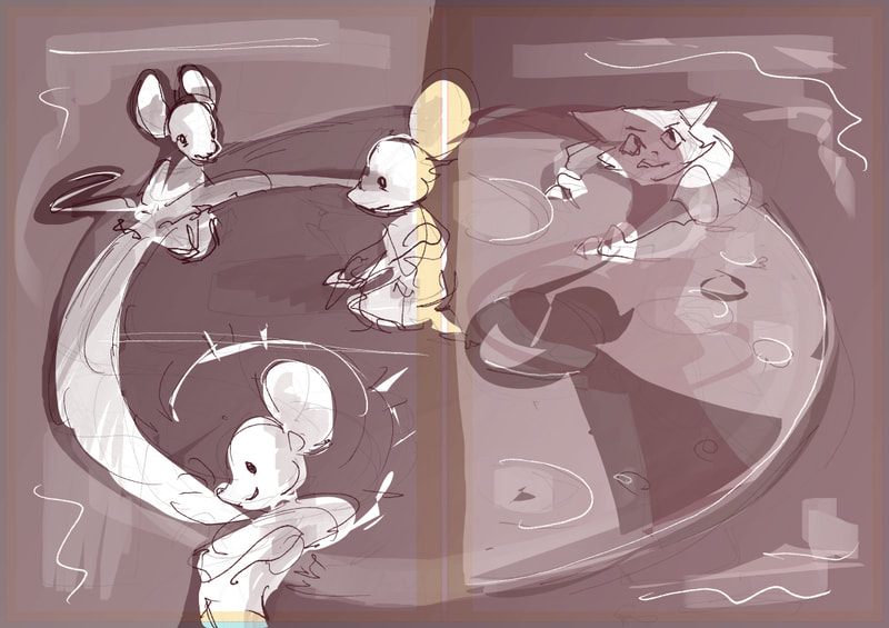
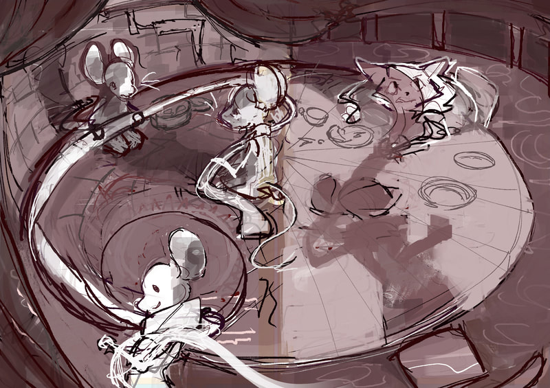
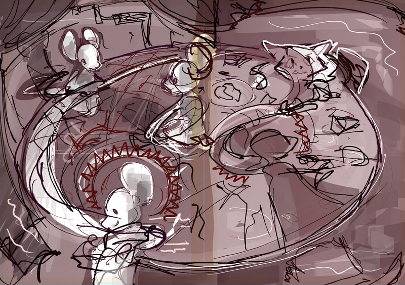
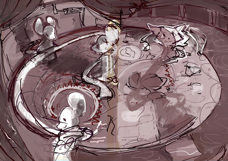
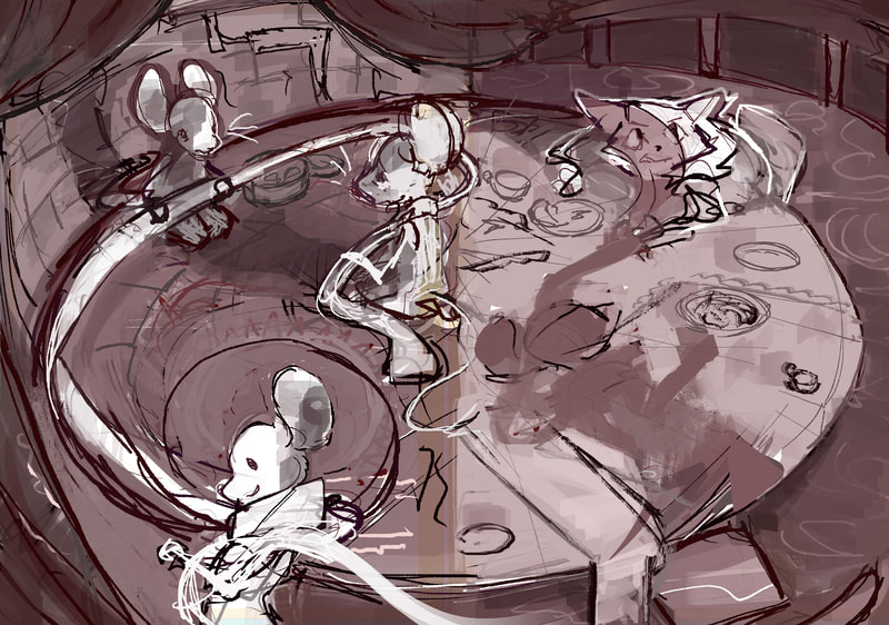
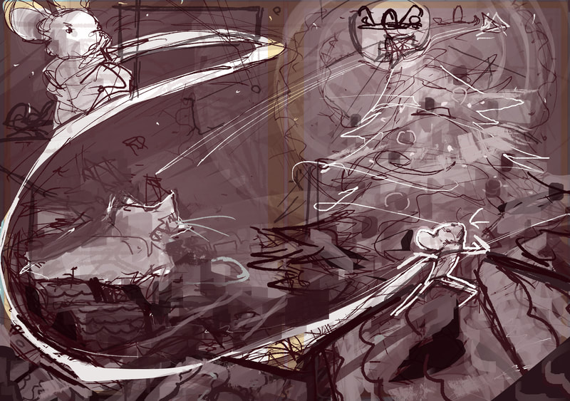
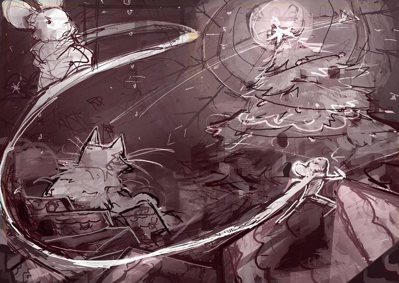
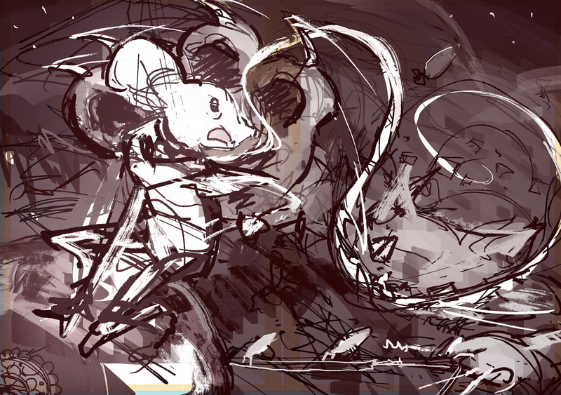
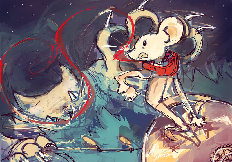
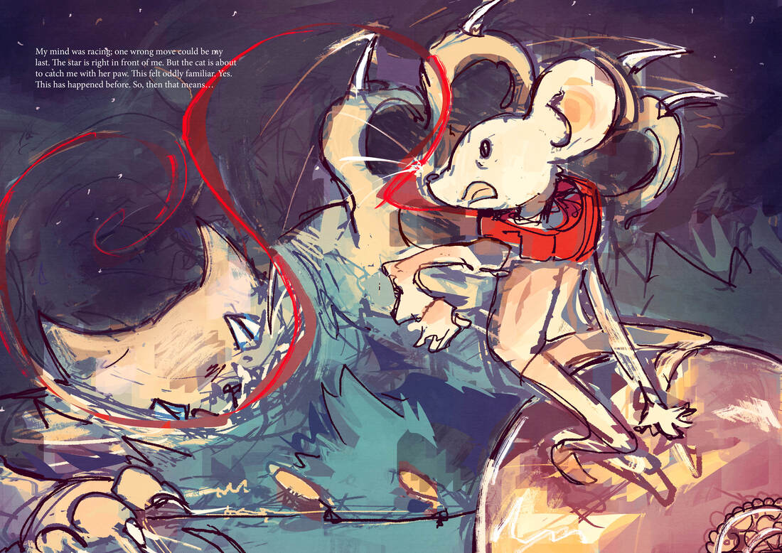
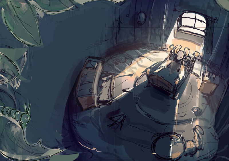
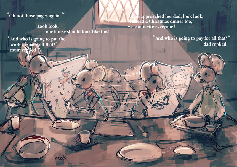
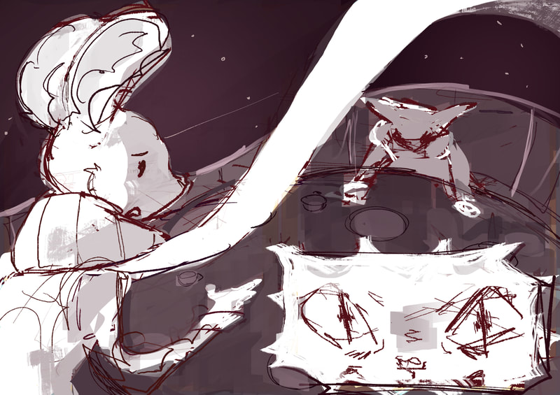
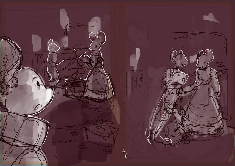
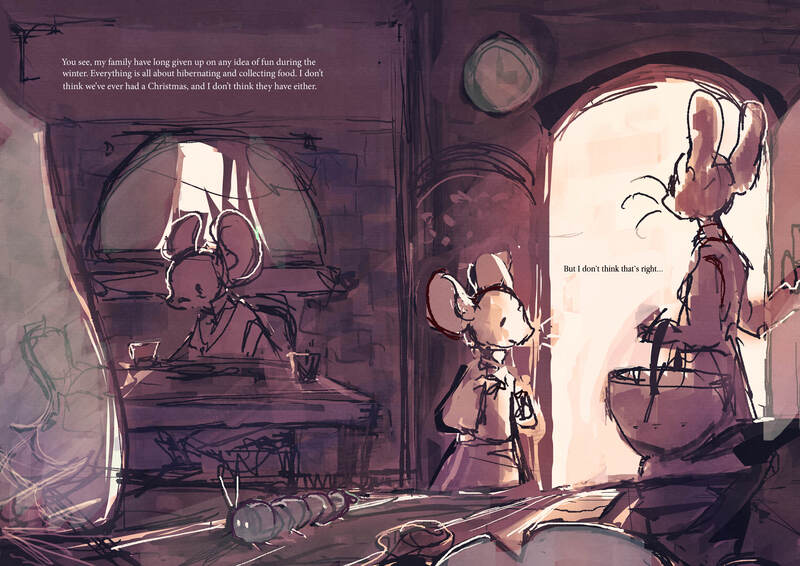
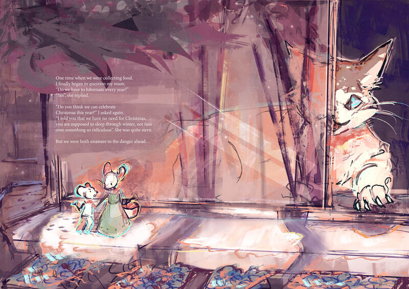
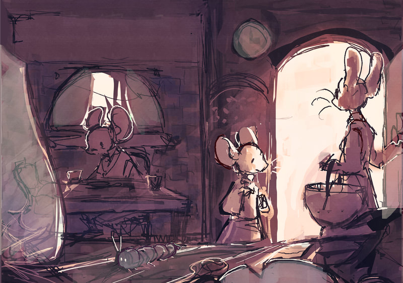
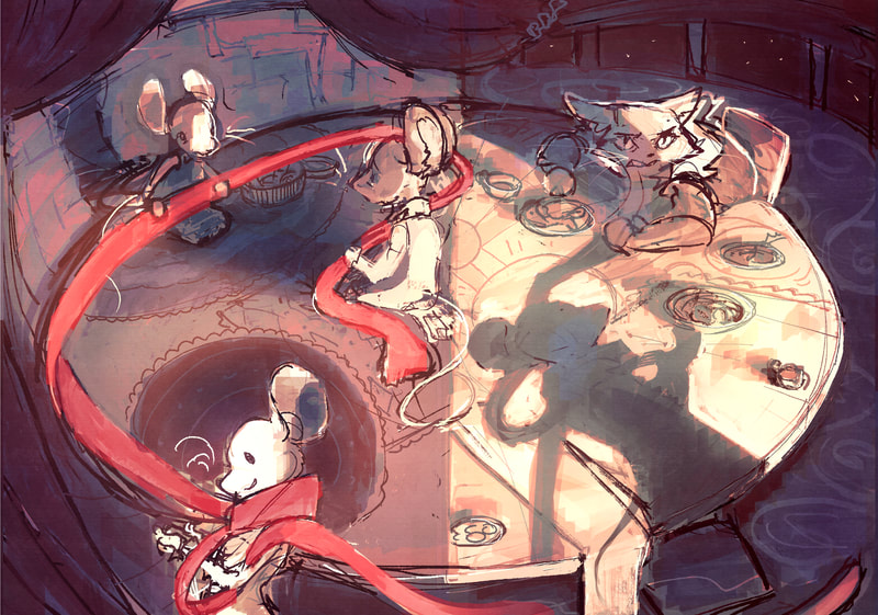
redesigned the first page to include more perspective and composition.
light dynamics and colour theory
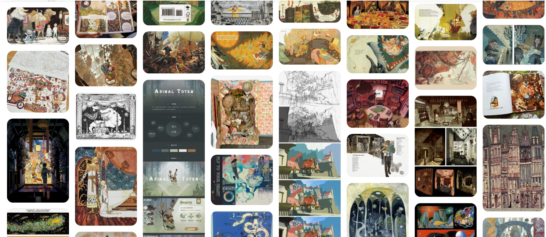
I decided to look into values and colour theory to try and improve my work, as I am leaning to more of a 3d environment these aspects are very important.
|
|
|
|
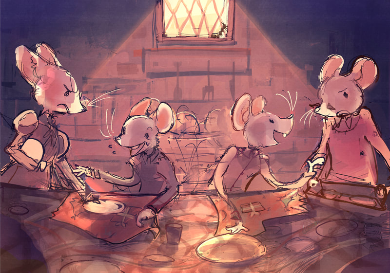
The lighting mentor was very informative and helped me understand this topic more, learning about different types of lighting and how colours change depending on their temperature and location in a composition.
|
|
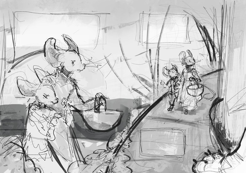
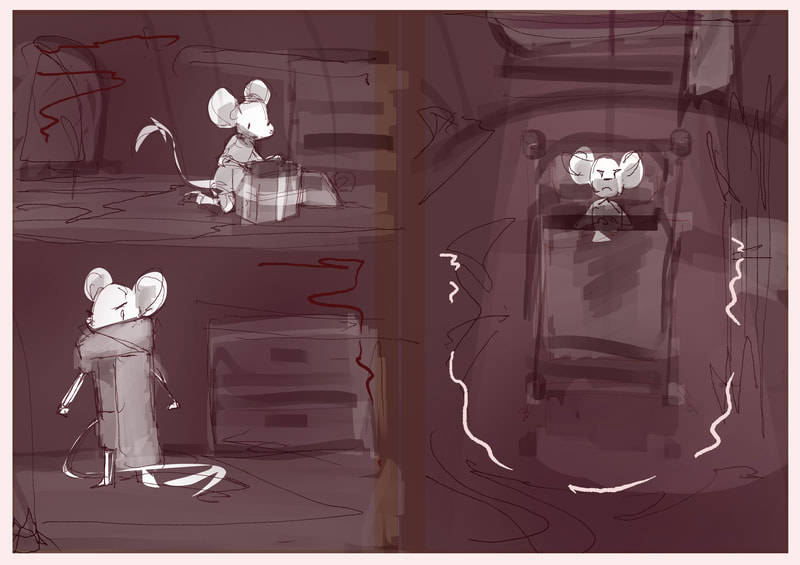
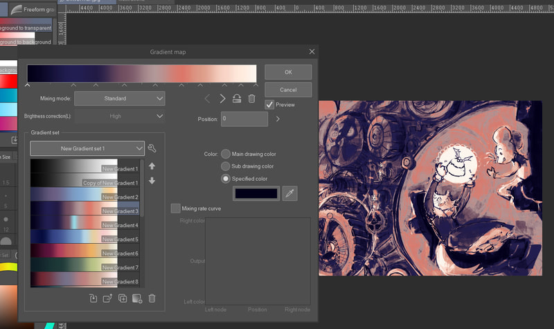
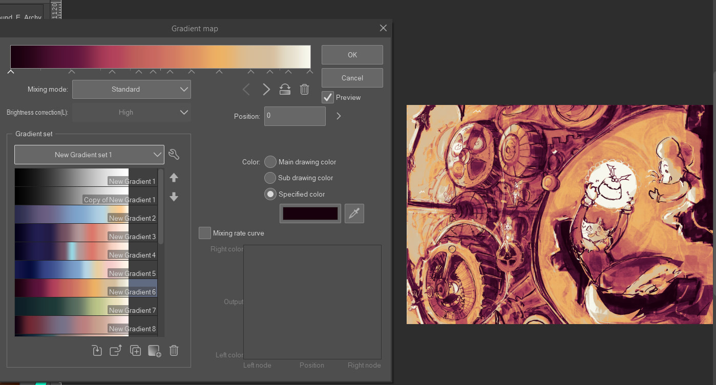
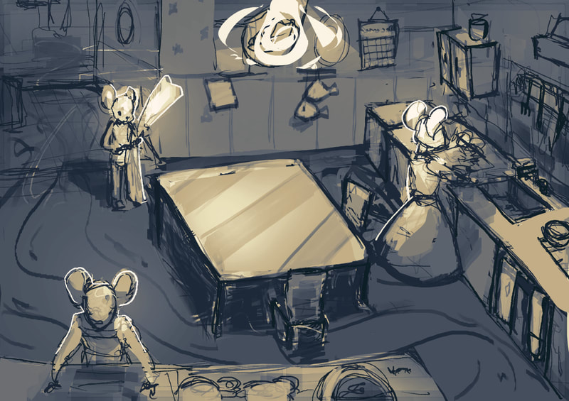
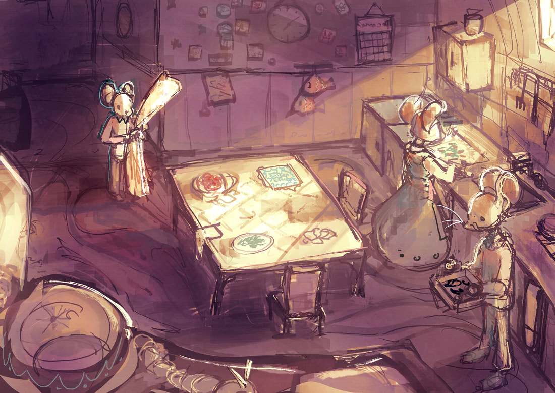
this taught me about starting with values and using gradient maps/ overlay layers to colour in a project. this has been very helpful for me as focusing on the values and details without having to worry about colours mix until later speeds up the process significantly
|
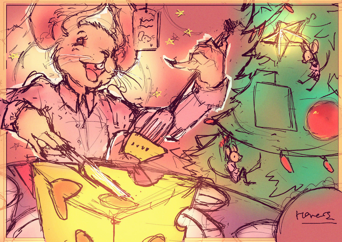
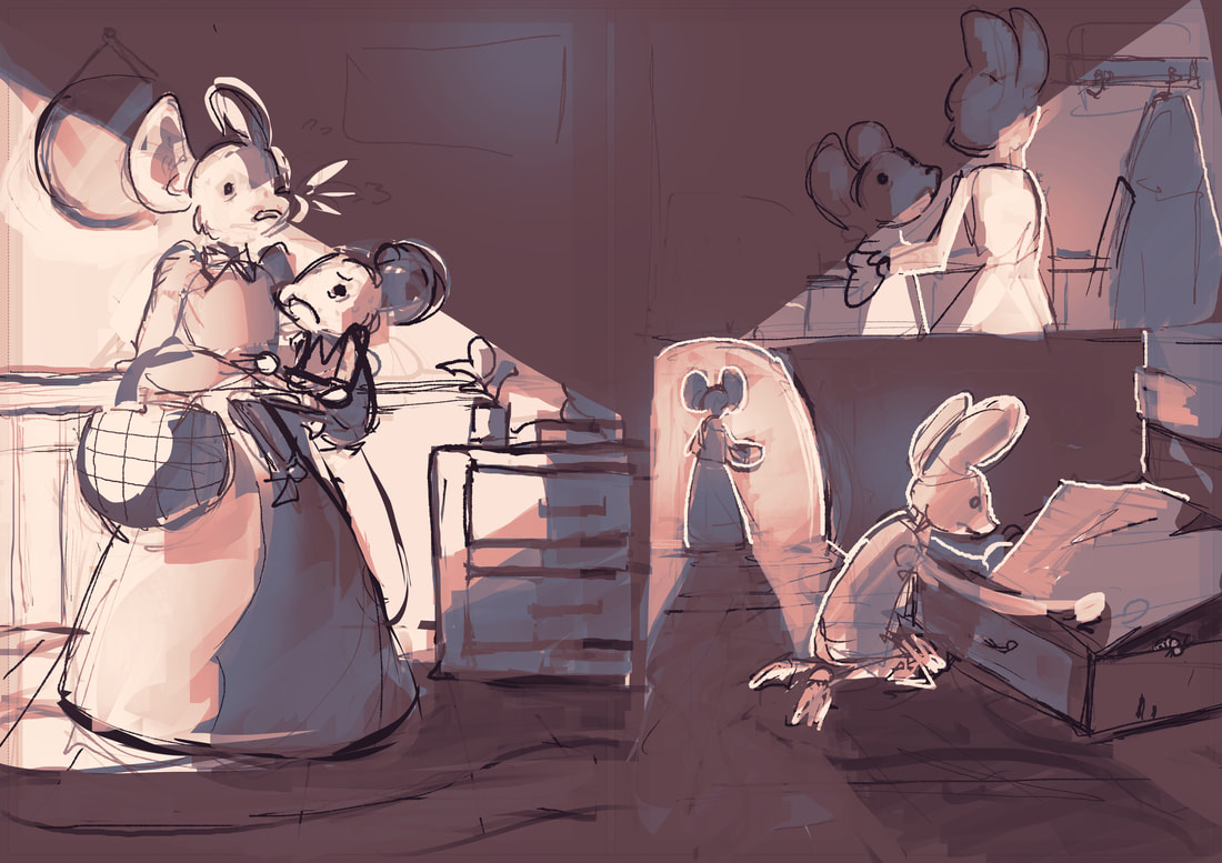
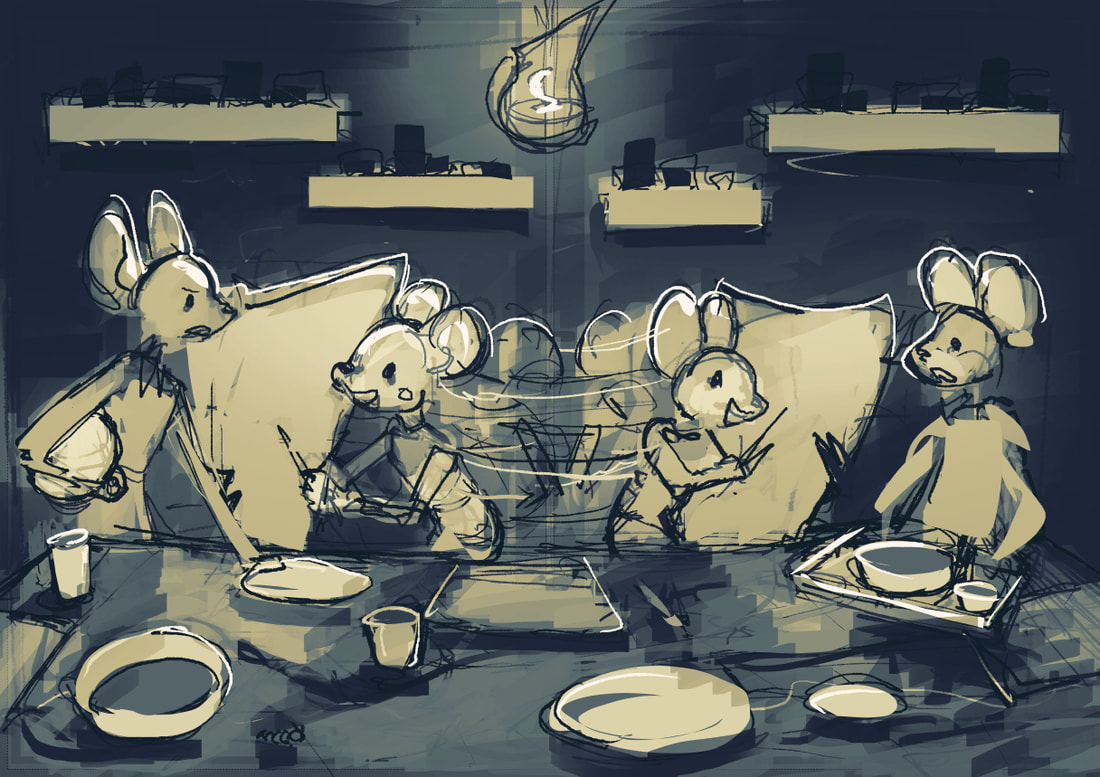
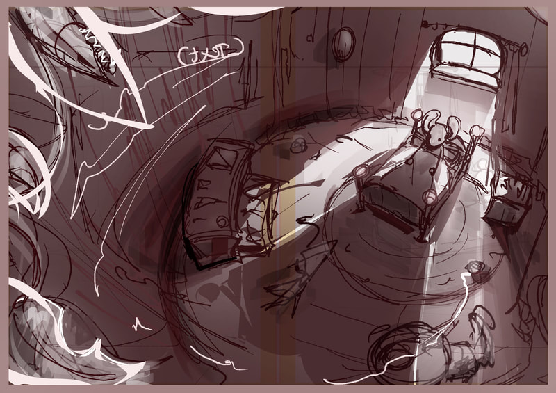
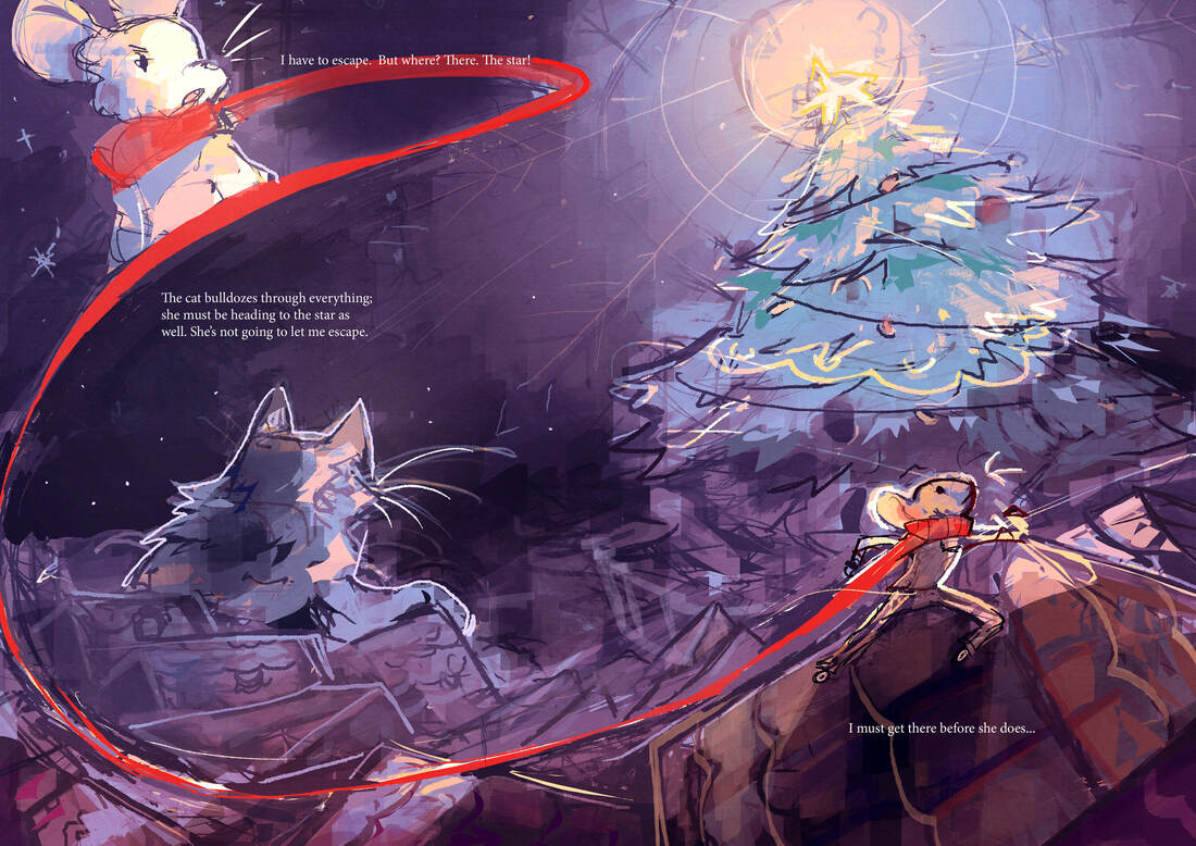
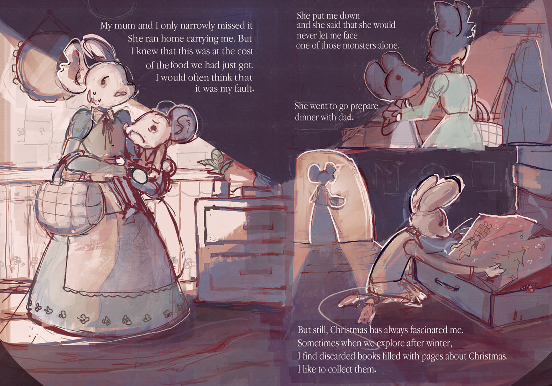
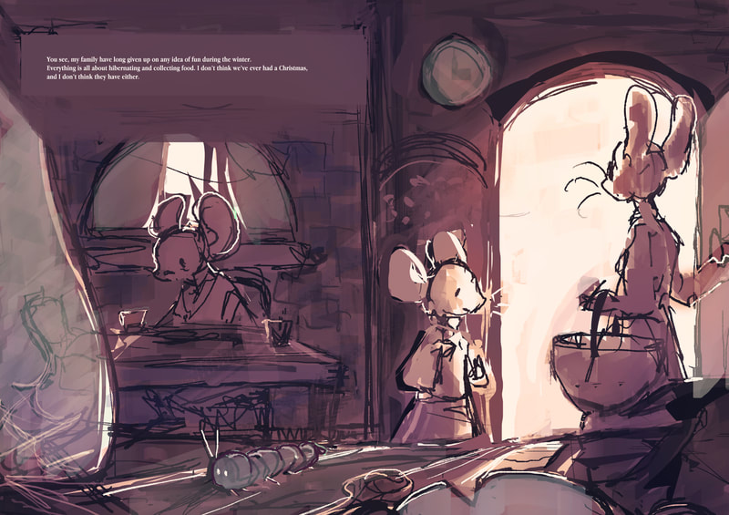
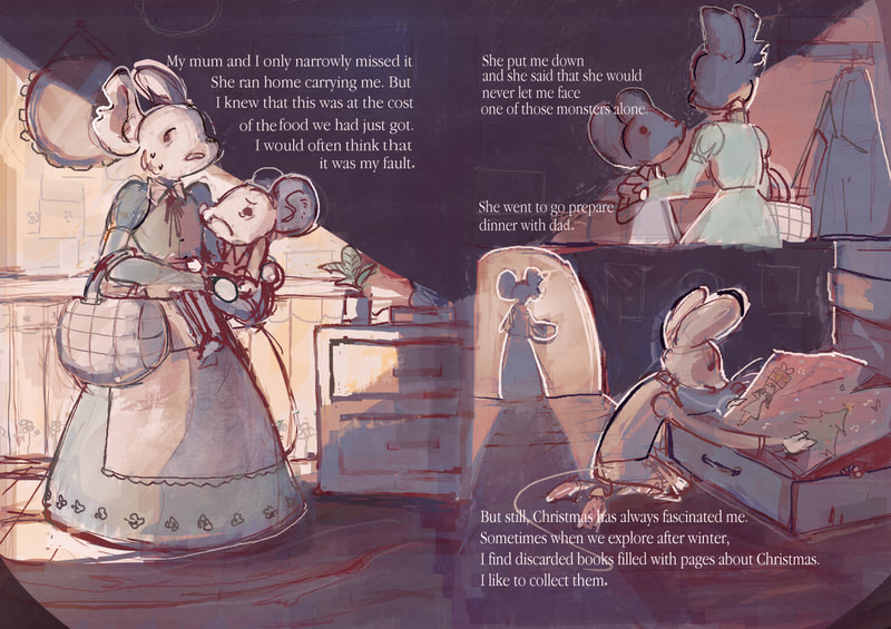
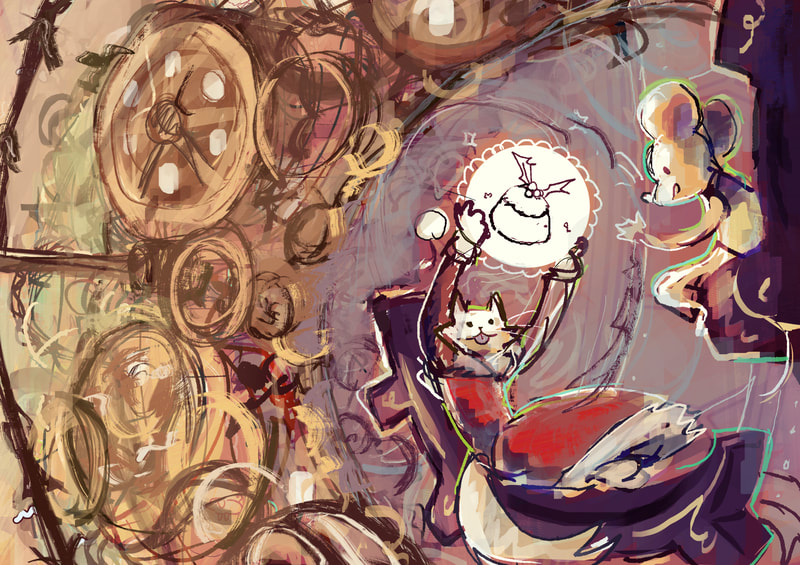
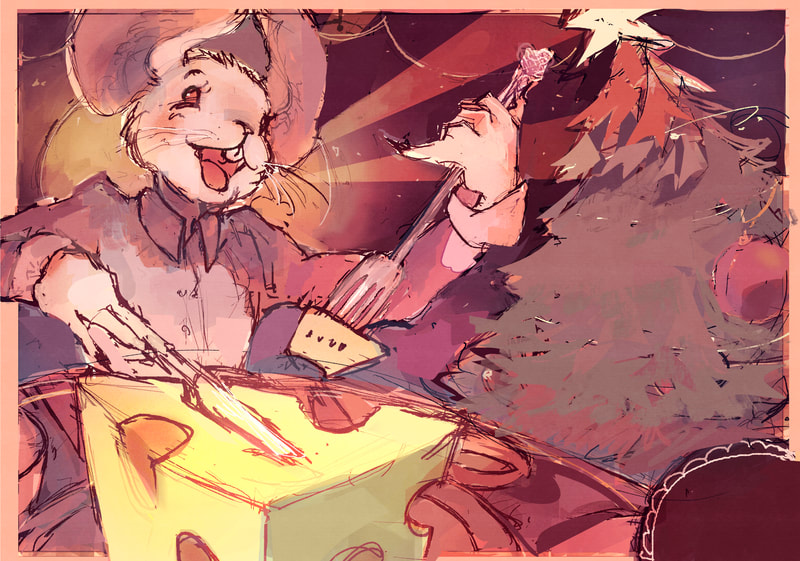
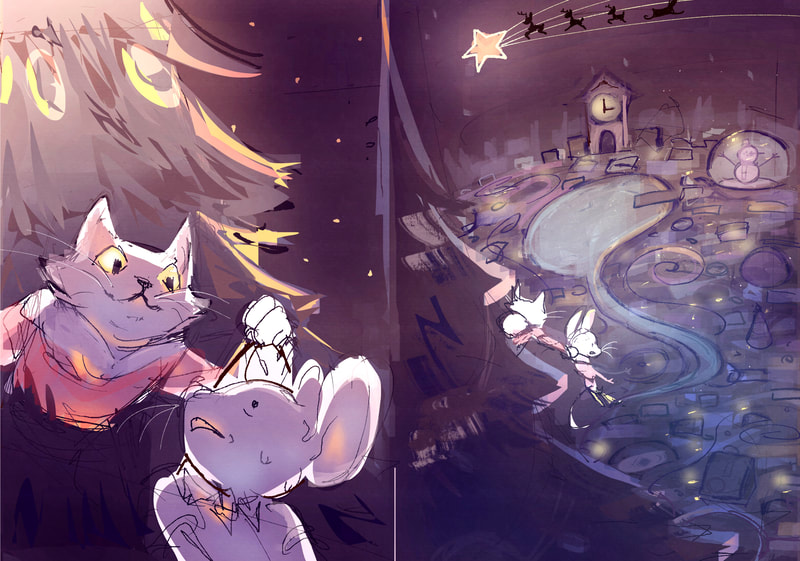
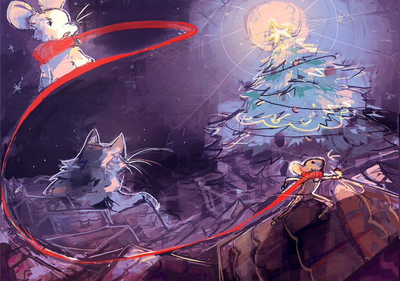
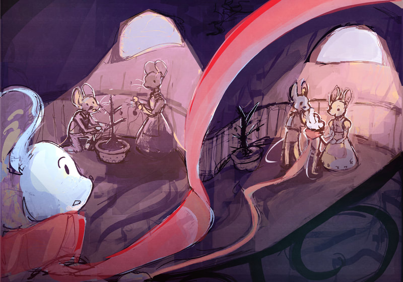
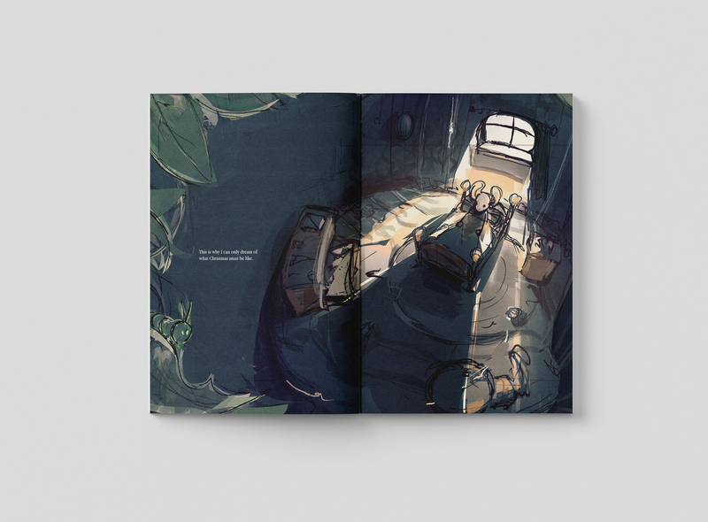
I quite like how this turned out, the lighting creates a contrast that focuses on the protagonist despite there being other characters in the page.
I also learned how important values are when trying to make a piece work. colours will not work unless the values work. Also the importance in contrast in every aspect in a piece. light and dark, saturated and desaturated, soft edge and hard edge, warm colours and cold colours, etc.
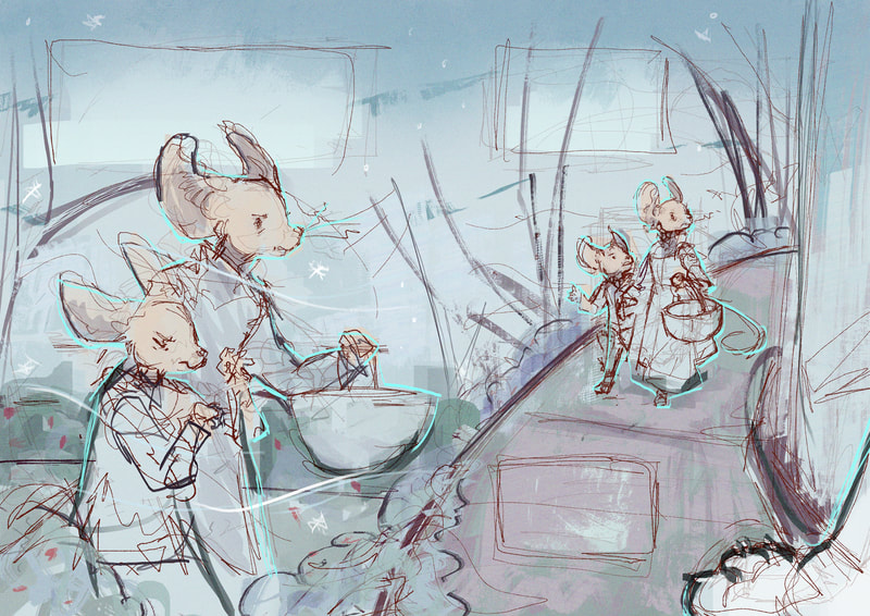
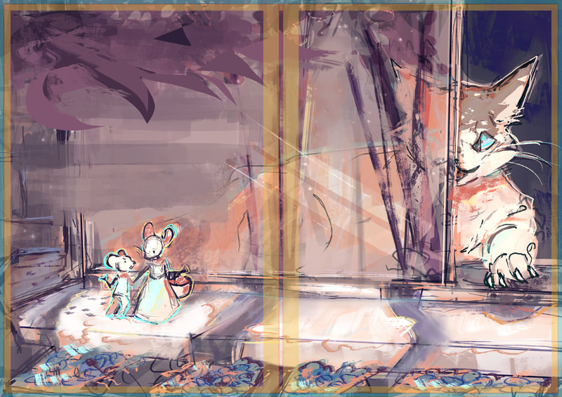
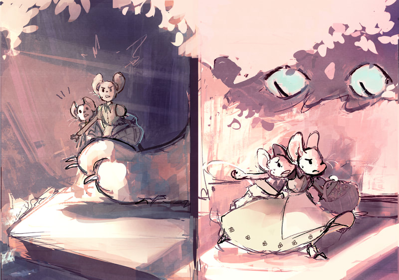
Here I tried the same technique but the the characters are outside. which can be quite tricky since it's not as easy to control everything like you can in an enclosed environment such as a house. But I guess it just comes with having a broader visual library for these things. Which I need to build on. I still liked how it turned out, mostly for the colours.
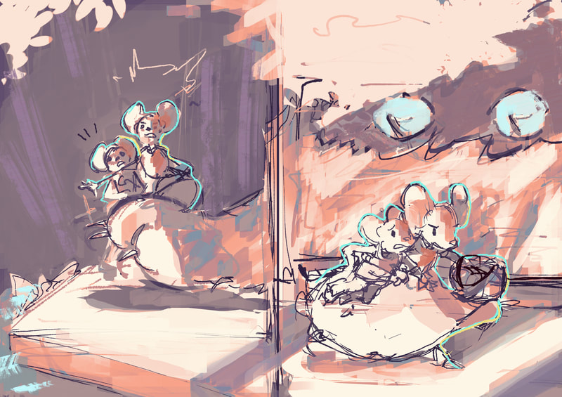
these are some more pages that will need more tweaking with colours and details
Character design
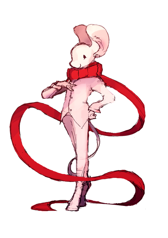
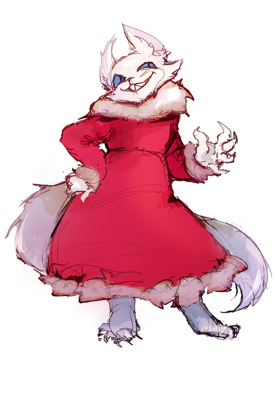
updated character designs. Luna on the left, the cat on the right
perspective
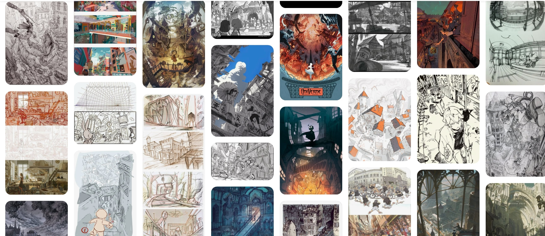
I returned back to my perspective studies to better my understanding of perspective. I wanted to use a mix of perspectives in my work. such as one, two, three, four point perspectives.
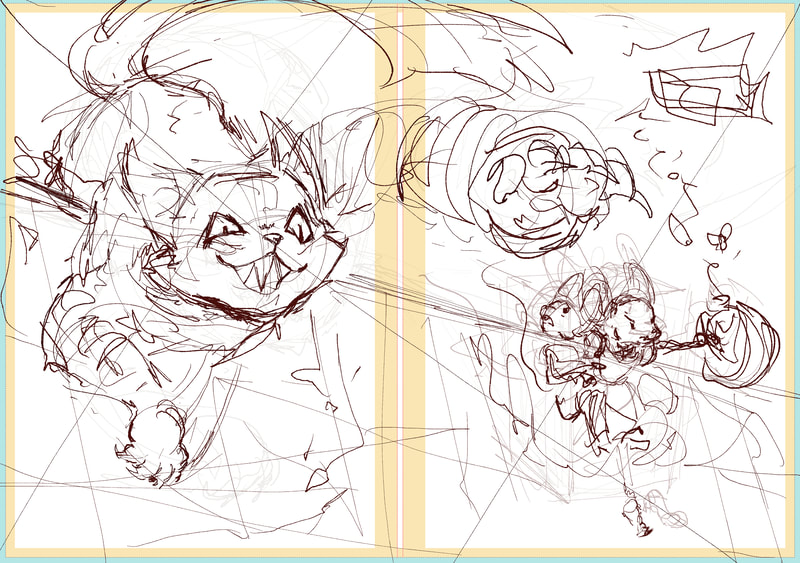
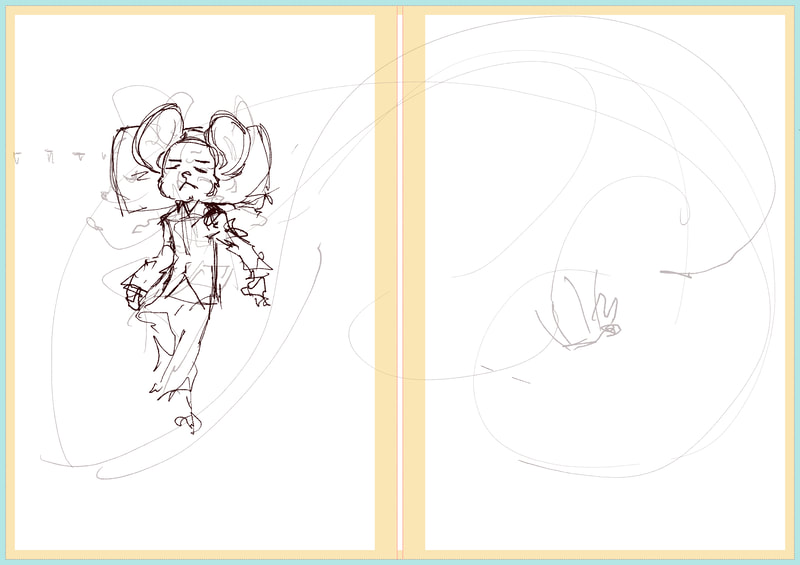
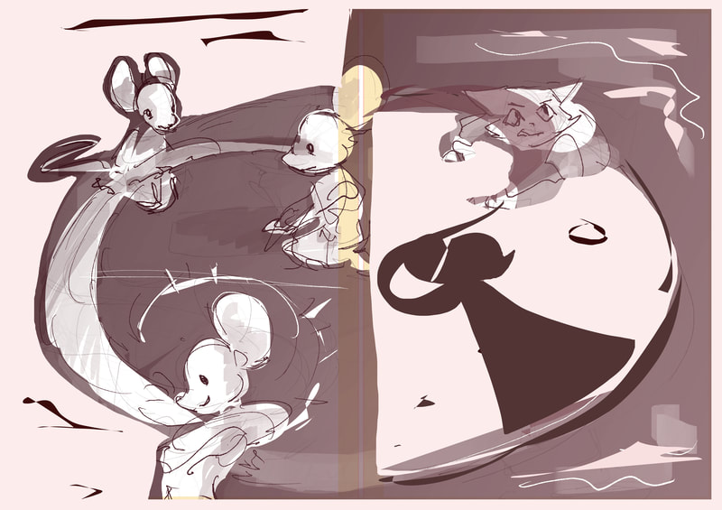
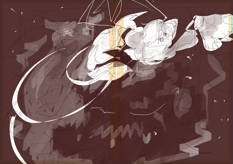
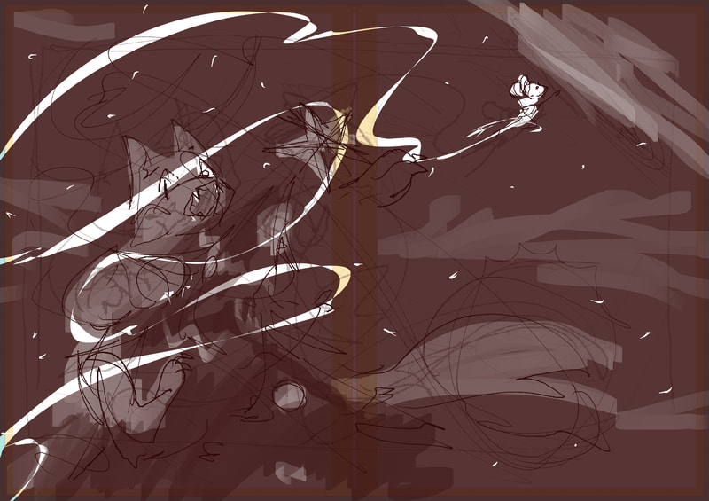
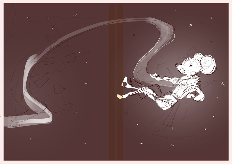
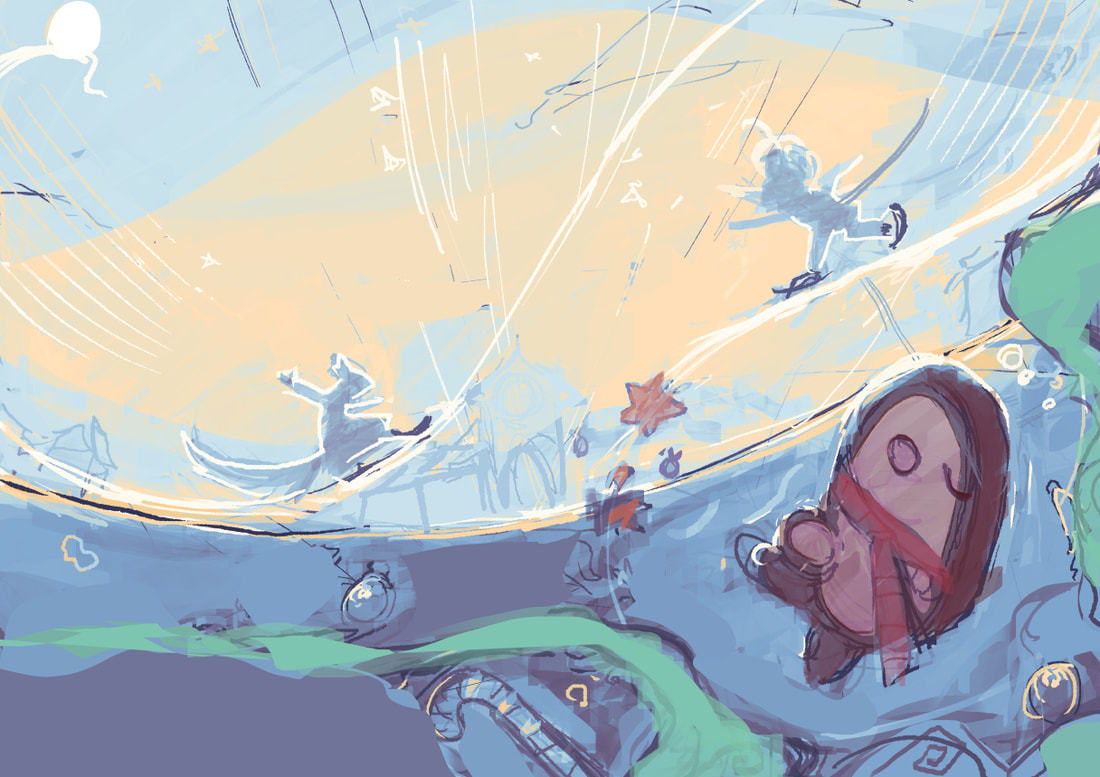
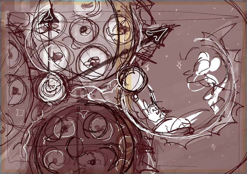
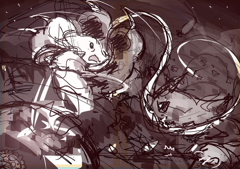
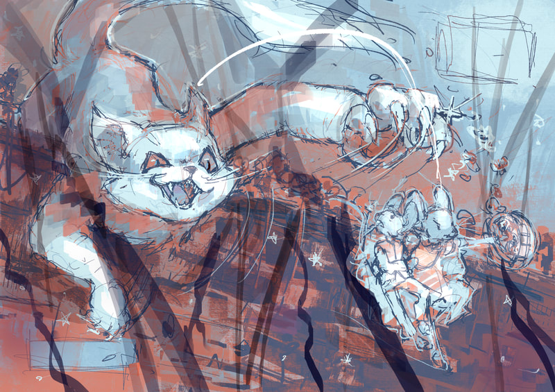
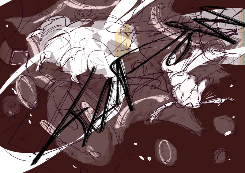
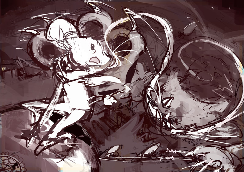
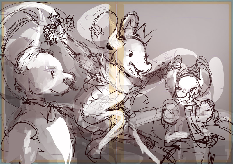
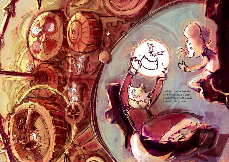
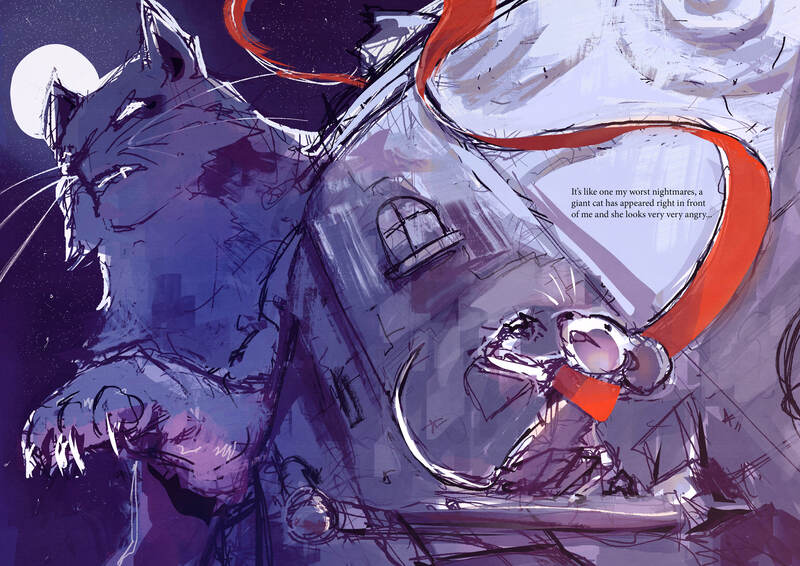
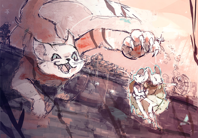
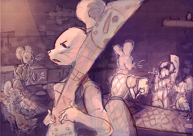
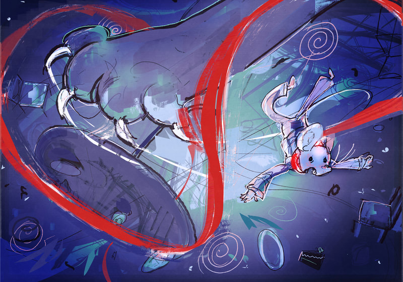
Here I wanted to be a bit more abstract with the perspective and lighting. making it more dramatic.
hmmm...I have a lot of pages to do...
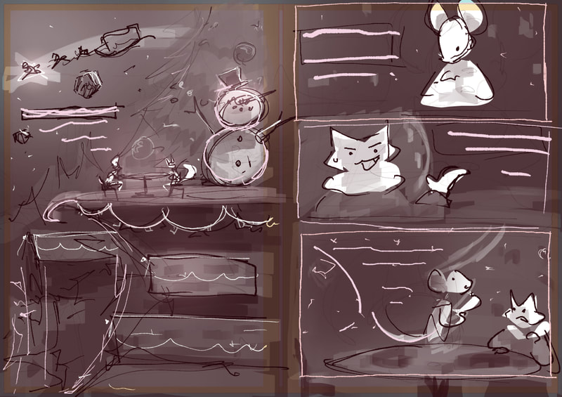
The holidays begin and I realise I still have another 26 double page spreads to do, plus a book cover. So I separate those 3 weeks into, sketching the initial ideas, adding values and some rendering. This was the result.
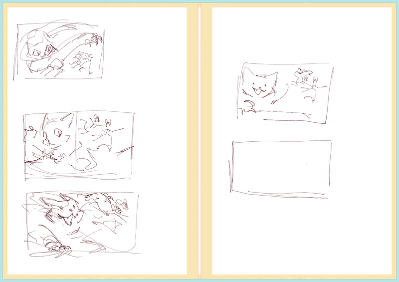
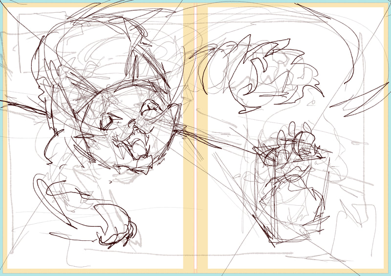
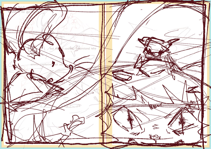
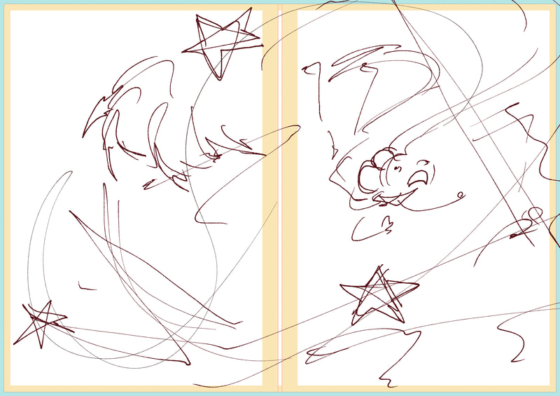
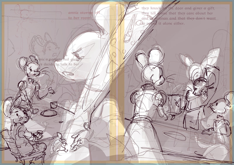
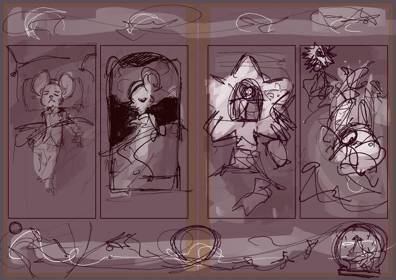
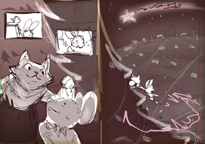
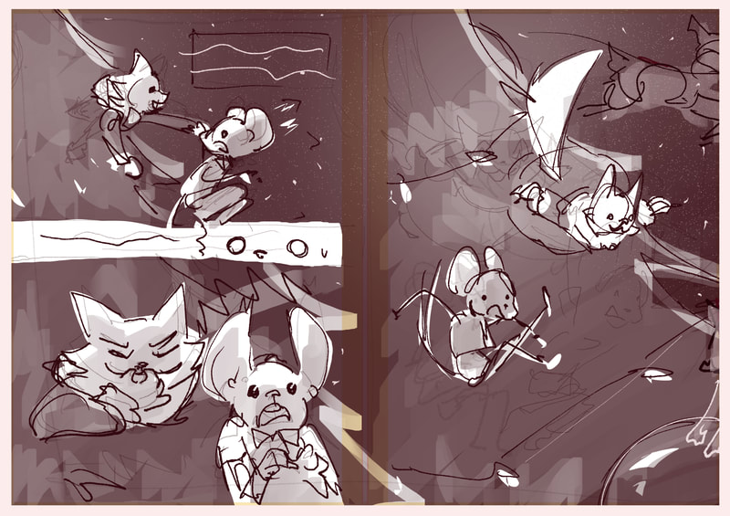
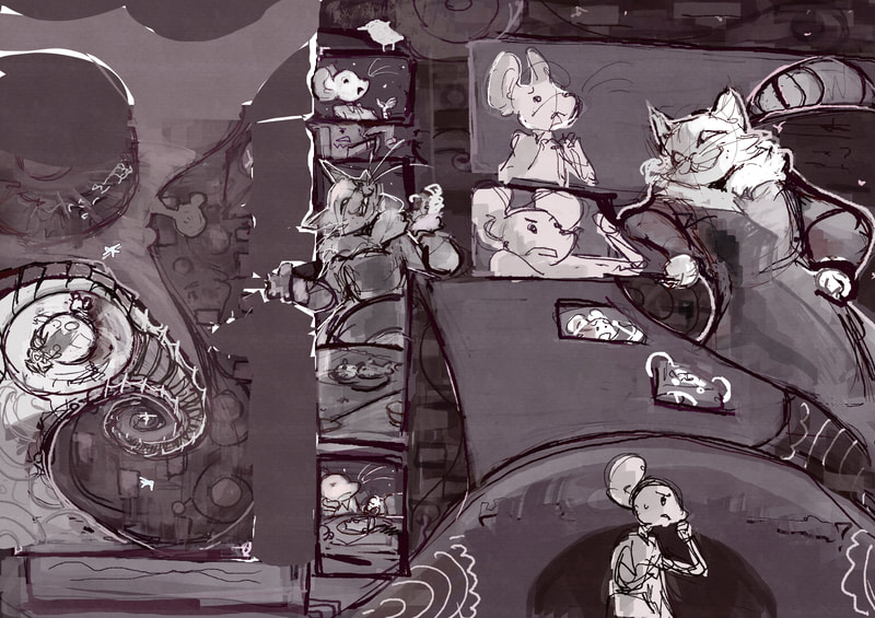
my process was to try and make sure every page had an idea and values, I spent one week and a half drawing ideas for each page and another added values to them. this gives me more oversight into how the final project will look way before i've finished it. which means that if some parts need redone I can realise it early on. such as I plan on re doing the final quarter of the book.
Gradient mapping
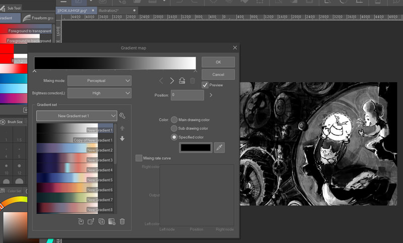
To convert my images from greyscale to colour, I used a new tool I had learned called gradient mapping. Clip studio paint has this feature and I can assign a colour to a value using a gradient like tool. This allows me to experiment more with colours and also lets me save gradients that I can use on other images.
first quarter of the book should flow like this
shape language
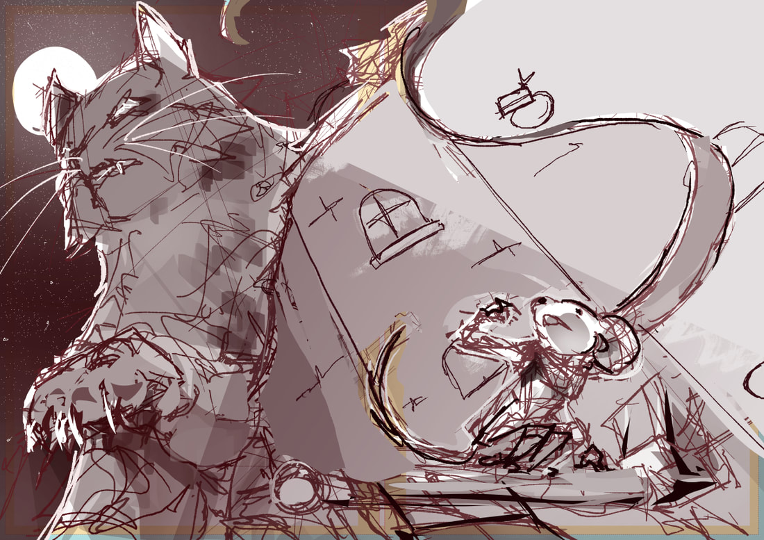
I wanted to focus more on shape language to help improve my compositions and body language
the next three pages take place in the centre of the book and are designed to show case what the world is like. it gives more of a reason as to the why the protag would consider staying there
CHRISTMAS PAGES
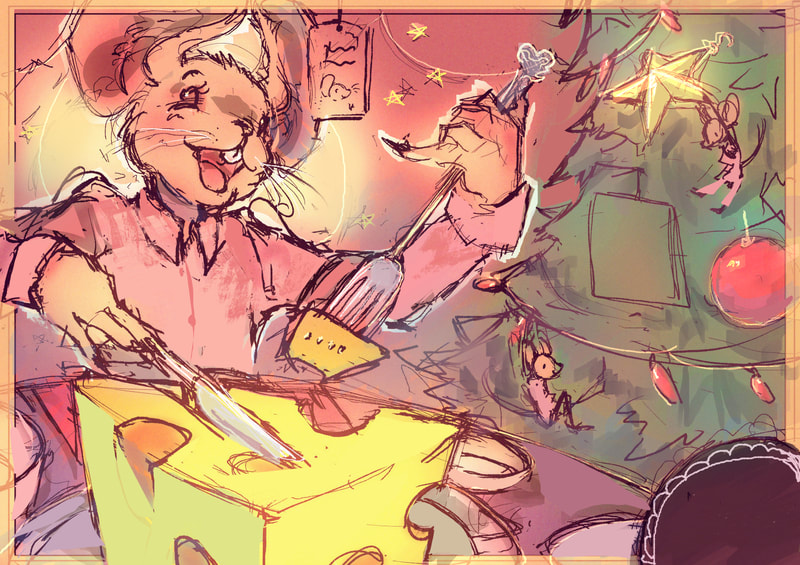
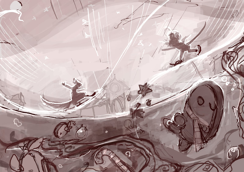
I wanted to have 3 pages that focus on Christmas themes, these would just be used to explore the world and add some more context.
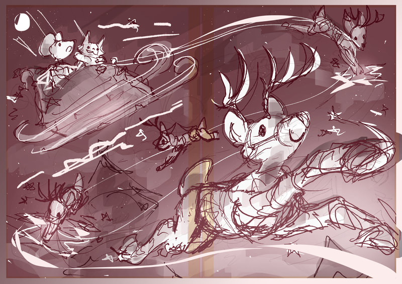
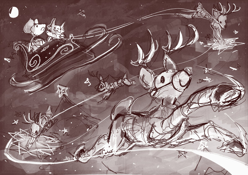
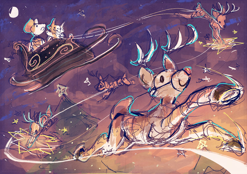
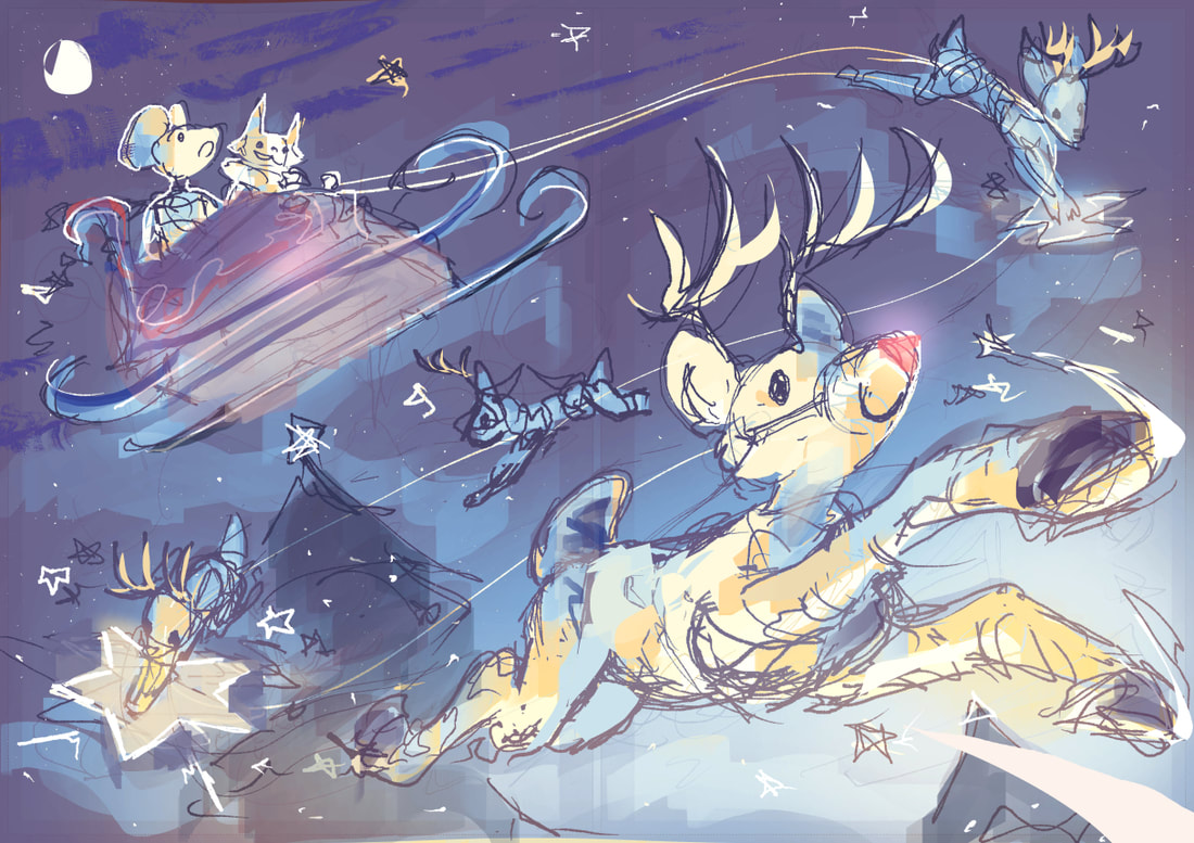
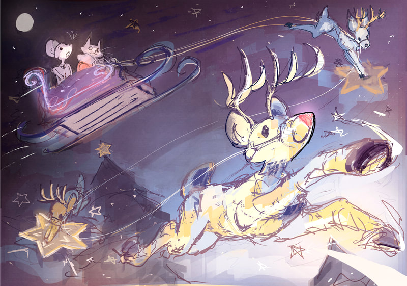
reindeer themed page
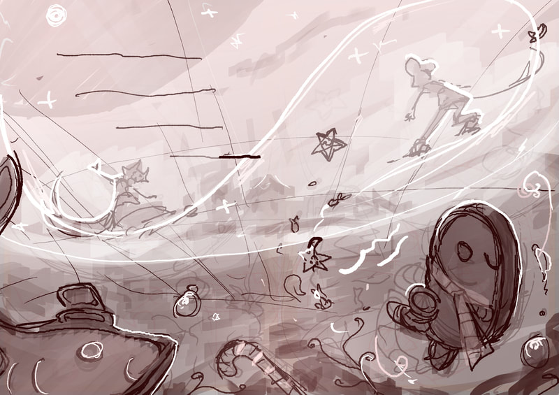
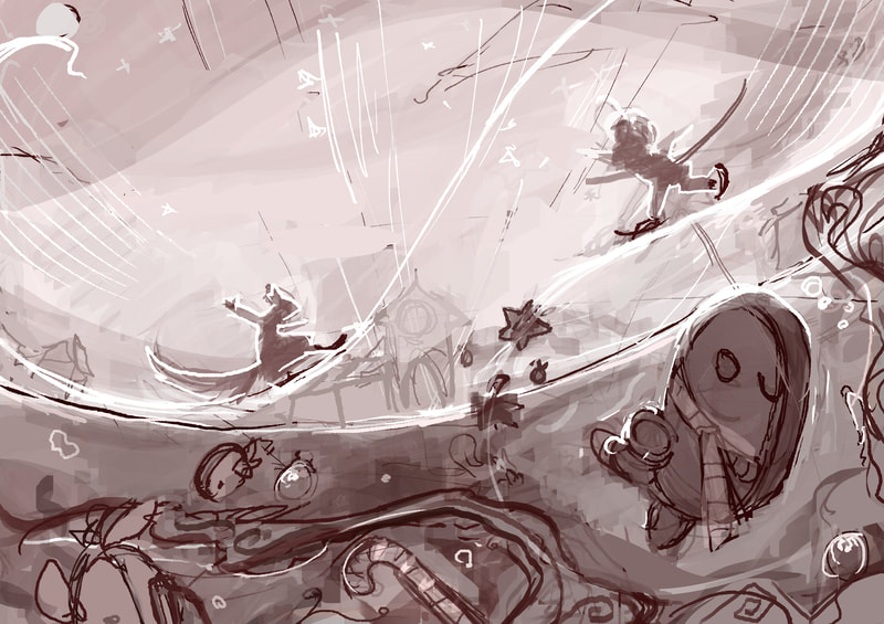
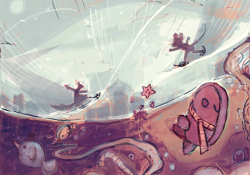
ice skating page
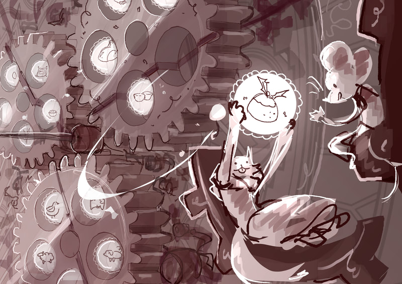
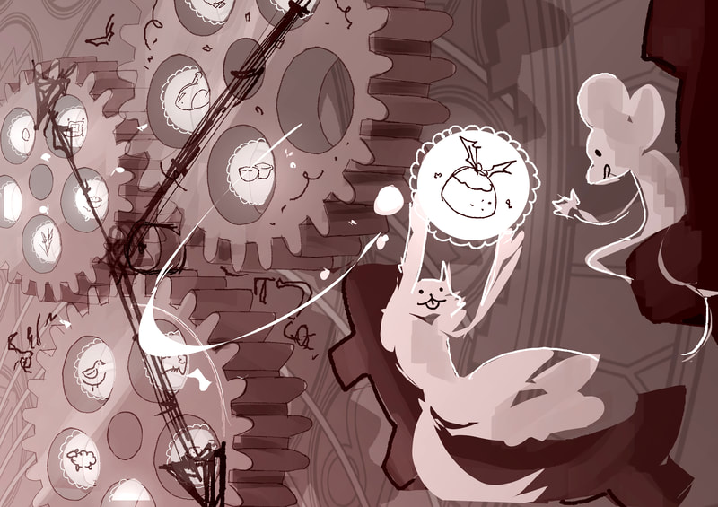
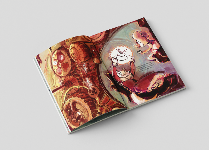
Christmas food page
text
text keeps getting squished, clip studio paint is quite atrocious for typography
final quarter
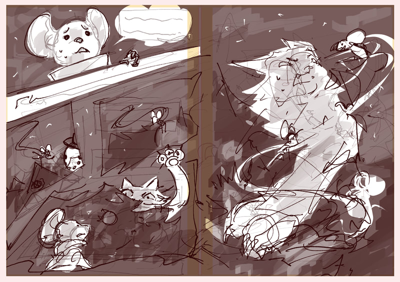
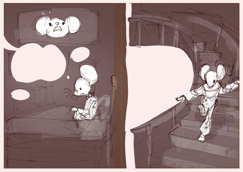
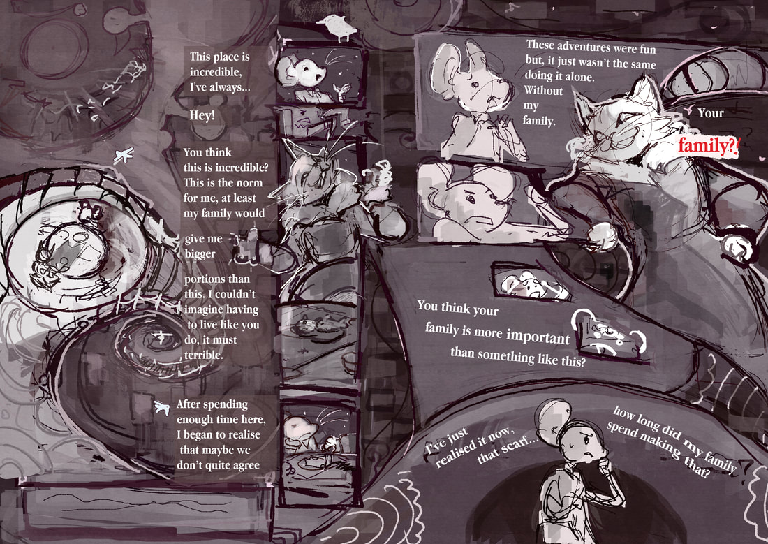
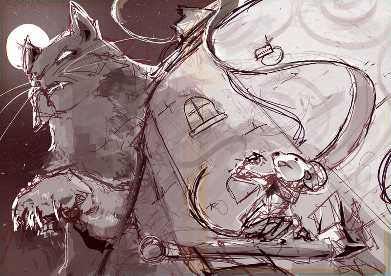
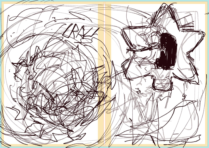
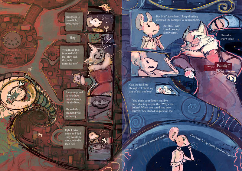
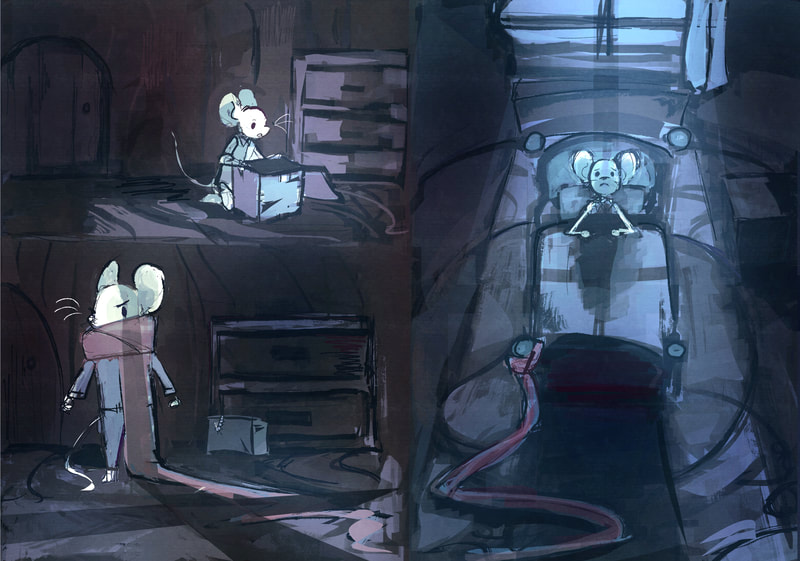
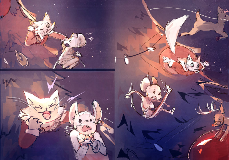
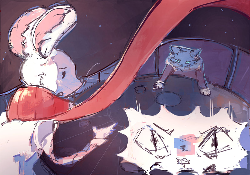
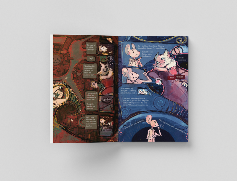
protag begins to dislike the cat. Here I've tried to remind the audience that what she shaving is a dream. so things stop making sense.
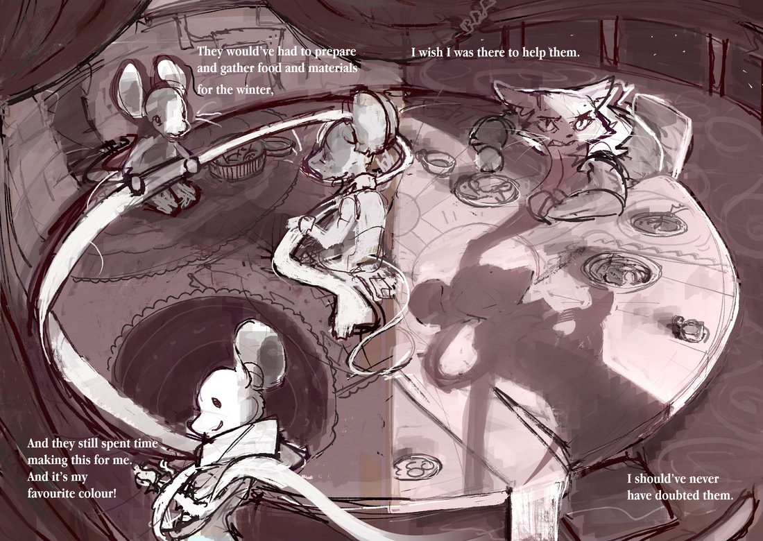
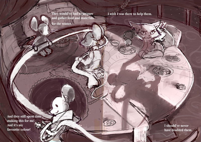
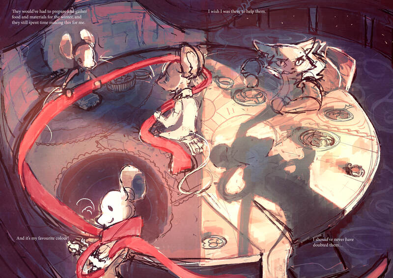
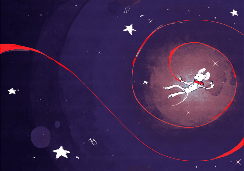
the circle page, protag realises she actually likes the scarf and wants to go back
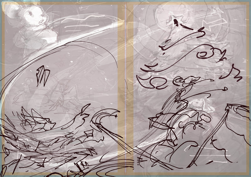
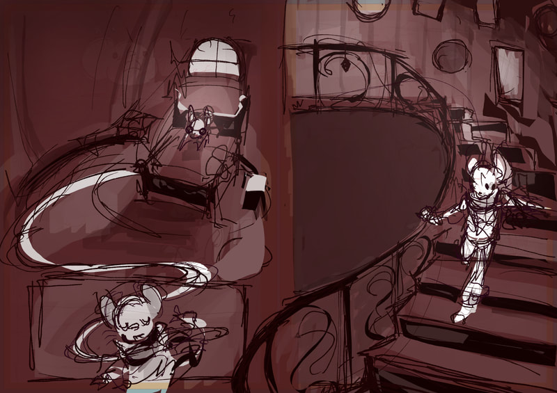
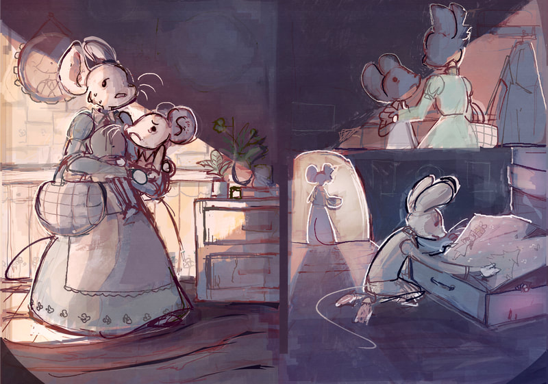
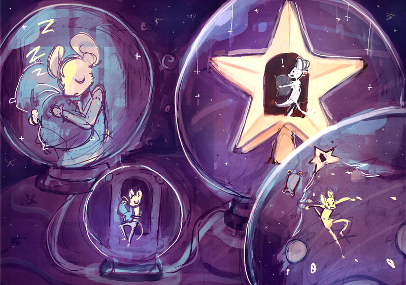
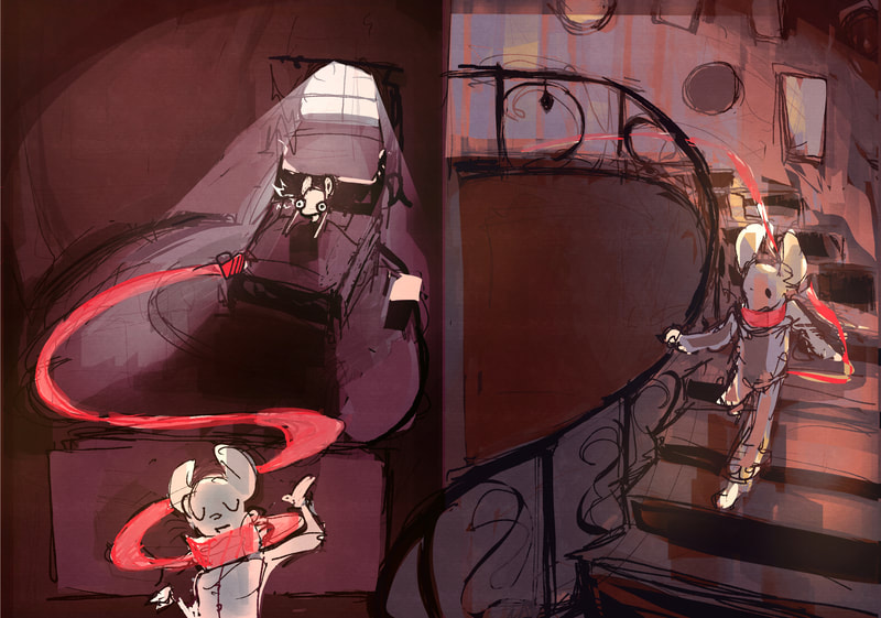
luna running across house to get to the star
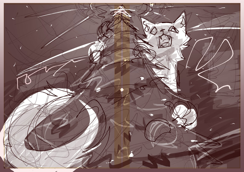
protag running up the tree to get to the star
FINAL PAGE IN OTHER WORLD
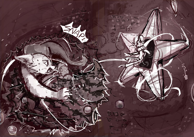
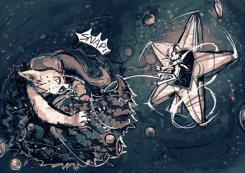
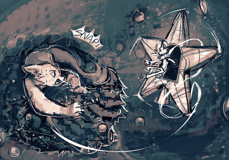
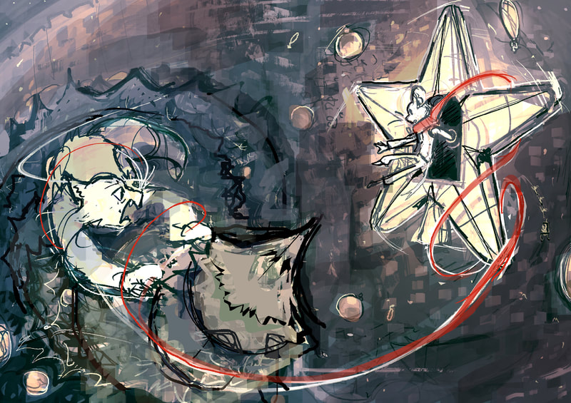
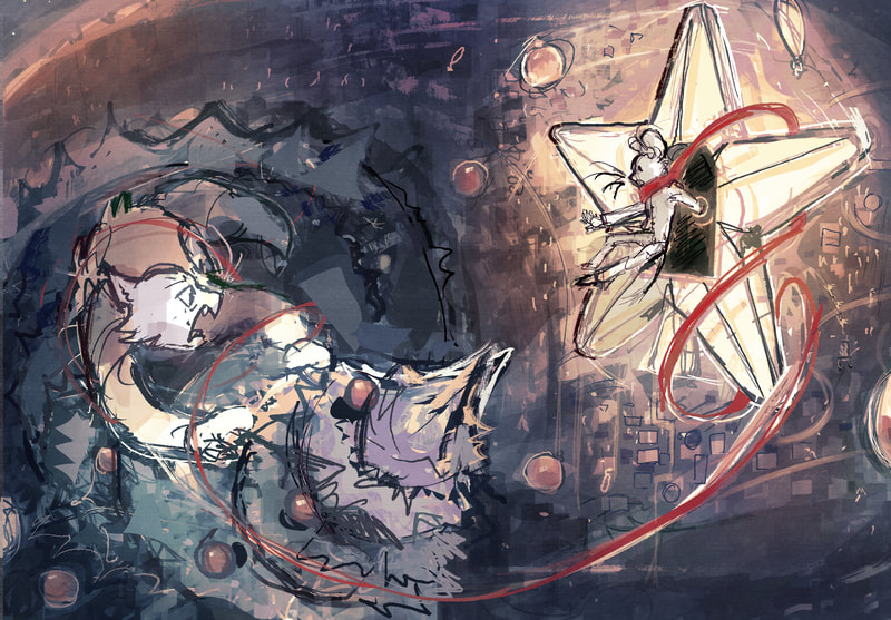
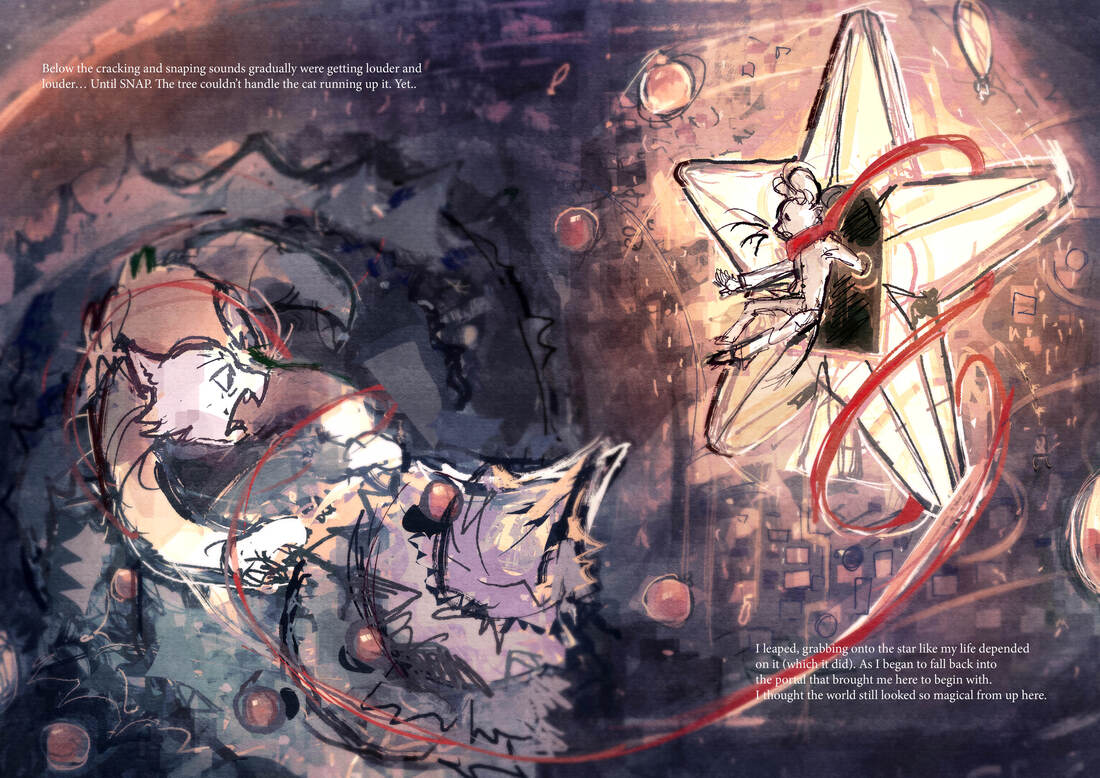
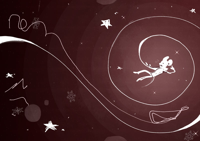
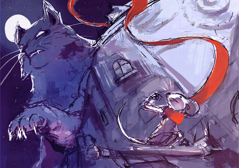
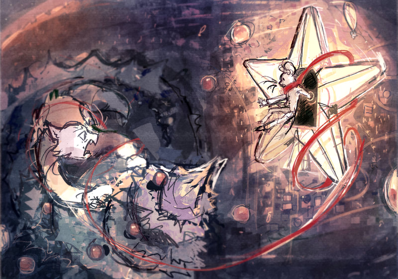
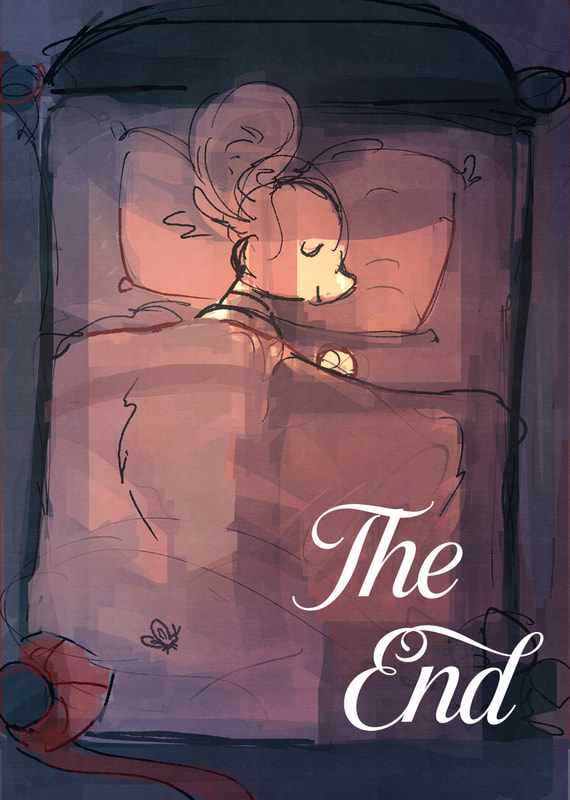
final bit, protag manages to get onto the star as the tree snaps due to the cat running up it
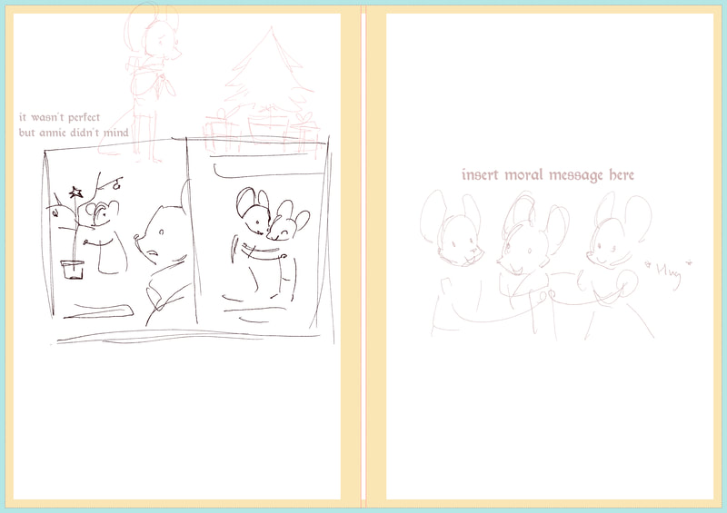
more text
REWORKING
I quite liked the composition of this page, but I felt like it wasn't holding up to my standards. So decided to try and make some time to improve it. I added a foreground and change the lighting so there's more of a focus.
current state of the book
still much to do, Next focus will be colour and further rendering.
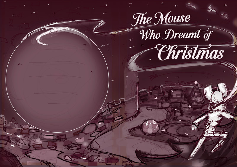
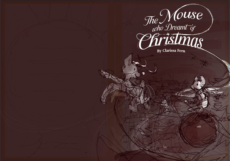
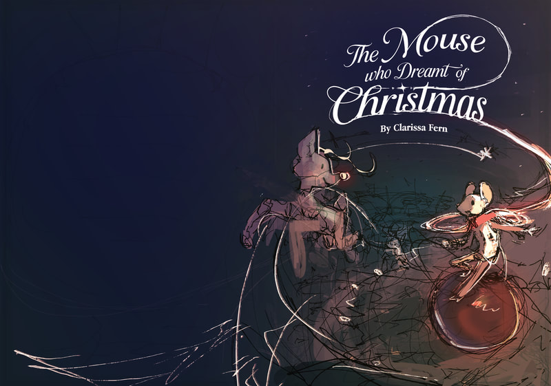
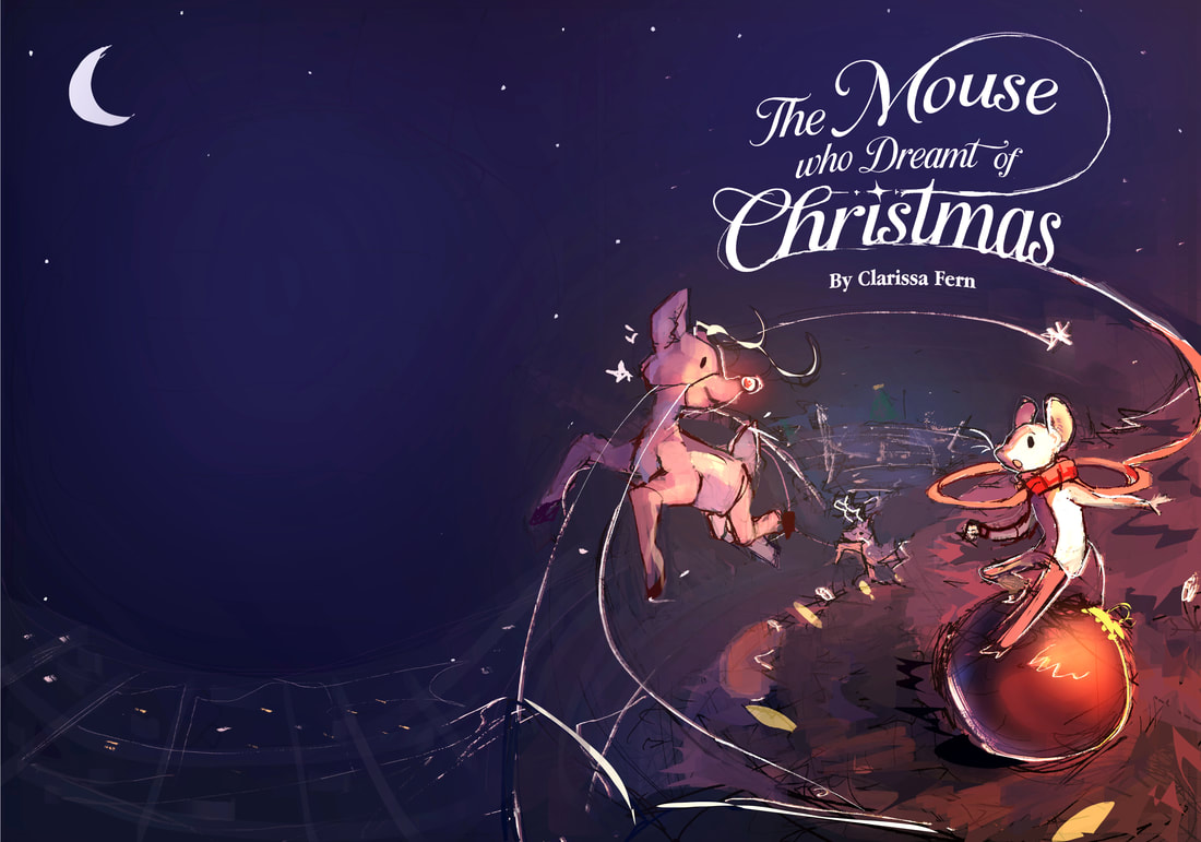
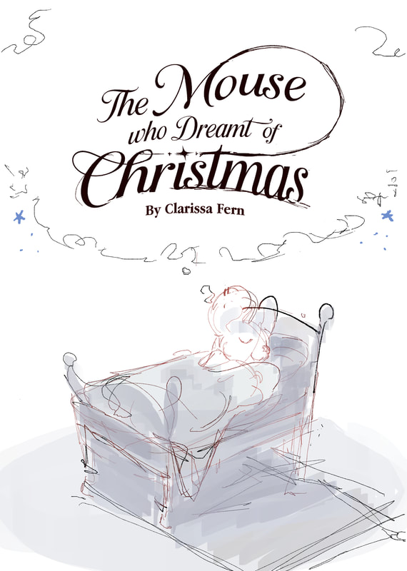
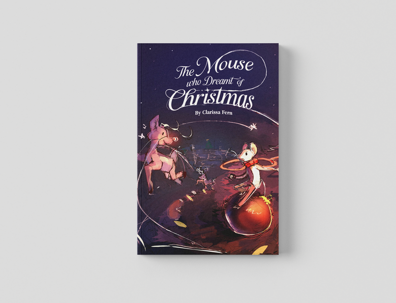
Book jacket and title
In the end, I changed the title to include the scarf that the protag wears but this time it works better with the type.
current state
Indesign
InDesign was very difficult to work with at first, eventually I managed to get used to it and used it to add all my text to my works.
final draft
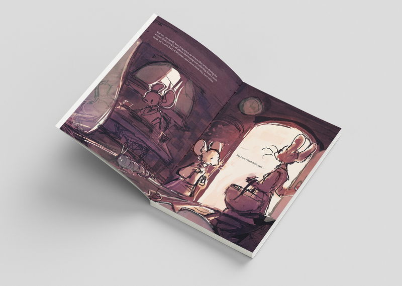
so, the book is mostly done now for the final tweaks and to submit onto mixam
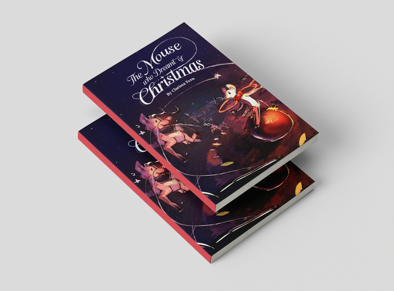
mockups
Evaluation
What I liked:
Throughout this journey I started to learn what styles and formats I'm interested in and I especially like film/ animation. Creating an 3d environment and creating the atmosphere for it is something I'm very interested in. Especially when I get to associate it with stories, motive and emotion. This project has helped me understand what I'm more geared towards and potential career choices that I could look into.
I feel like my strengths are with drawing environments and using lighting/ perspective to do so. I also can work quite quickly.
What I could do better:
I feel like me style isn't there yet, as I am eager to get back to studying I keep thinking of all the areas that need improvement in my work. To be simple, for my illustrations I just need to keep studying, I think my anatomy skills needs a bit of a upgrade and my understanding of compositions and scale. Next time I should try not to do 64 pages as well as a story within 3 months. My understanding of graphic design and typography is probably my weakest skill. As well as my confidence in presenting my work. I often tried to hide my story ideas since I wasn't used to discussing them with others and would just focus on the illustrations.
For the future:
In the future I should focus on my communication skills so I have a better chance at establishing myself as a illustrator, I will obviously be studying a lot to perfect my skills so I can keep creating more stories. But I can't expect my work to create a following for me I need to be present more.
